
When a user comes to your website, they don’t read all the text on the page. Instead, they scan first and read second. Users look for clues to help them quickly figure out what the page is about, what they should look at first, and what they should do next.
This is where the concept of visual hierarchy comes into play. Visual hierarchy plays a crucial role in the usability of your website. It helps create a website that’s not only easily understood and easily navigable but also, hopefully, fun to engage with.
In the sections below, we’ll discuss what a visual hierarchy is, why it’s important in the usability of a website, and how it helps users navigate your website.
So, What is Visual Hierarchy?
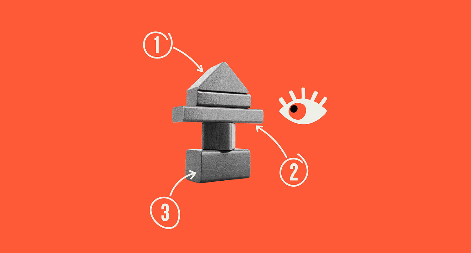
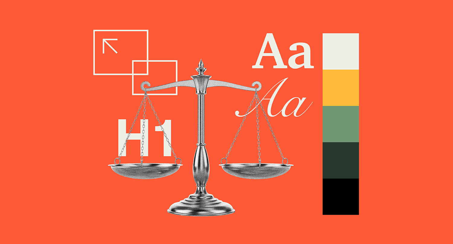
The term ‘visual hierarchy’ refers to how the elements on your website are placed to help users easily identify the most important information on the page.
Good visual hierarchy helps answer the following questions:
- What should the user look at first?
- What is the most important piece of information on the page?
- What action should the user take next?
To create a visual hierarchy on your website, the following elements might be employed:
- Headings
- Typography
- Size
- Scale
- Color
- Contrast
- Space
- Images
Without a visual hierarchy on your website, the user may not be able to easily navigate your website because they’re confused by numerous elements on the page.
A well-organized visual hierarchy is important for user experience as it enables users to quickly understand how to interact with a page. If a website doesn’t have a proper visual hierarchy, it can be difficult for users to find important information or know what to do next.
A well-organized visual hierarchy:
- Makes it easier for users to scan a page
- Makes important messages stand out
- Helps users navigate to calls-to-action
- Provides a better user experience overall
In other words, a visual hierarchy helps users find what they need without having to think about it too much.
User Behavior Statistics Every Web Designer Should Know
User behavior research shows that people evaluate and interact with websites much faster and more selectively than many designers might expect. Rather than carefully reading every element, visitors tend to make rapid judgments and focus only on content that immediately stands out. Because of this, clear structure and thoughtful visual emphasis play a critical role in helping users quickly understand and navigate a page.
A few website usability statistics:
- Users form a first impression of a website in about 50 milliseconds
- Users read only about 20–28% of the text on a typical web page during an average visit
- Users tend to rate visually simple websites as more attractive and easier to use

How People Actually Read Websites
Research has shown that users don’t read websites (like a book) from top to bottom. Instead, users tend to scan websites in patterns.
There are two common patterns that users use when scanning a page:
The F-Pattern
This is a common pattern for content-heavy pages like articles or blog posts.
When scanning a page, users tend to:
- Scan across the top of a page
- Scan down the left side of a page
- Scan across a few important areas of a page
The Z-Pattern
When scanning a page that doesn’t have a lot of content, users tend to:
- Start at the top left of a page
- Scan across a page
- Scan down a page in a diagonal pattern
- End at the bottom right of a page
By understanding user patterns like this, we can make sure that important areas of a page are prominent enough for users to see.
Key Elements That Create Visual Hierarchy
There are a few different design techniques that we can use to ensure a good visual hierarchy for a website:
1. Headings and Typography
Headings are a great way to organize a page of content. Headings help users quickly understand what a particular area of a page is about.
For example:
- Large headings: divide sections
- Subheadings: divide content into smaller sections
- Body text: add additional content
Proper heading structure and typography are pivotal to helping users quickly scan and find relevant information on a page without becoming overwhelmed. And the bonus? Relevant heading structure scores huge with SEO rankings as well.
2. Size and Scale
This is where larger items are given more attention than smaller items on a page.
Designers use size and scale techniques to draw attention to important content.
Important content or elements might include:
- Headlines
- Calls to action
- Key content
Example: a headline placed prominently at the top of a page allows users to quickly identify the content on that page.
3. Color and Contrast
Color is another means to direct attention to certain items on a page. Elements that stand out from the background tend to attract more attention.
This is used to direct attention to items such as:
- Call to action
- Important links
- Key content
Example: a brightly colored button on a background that’s less saturated makes it obvious to users where to click. Reduced cognitive load equals a win-win for all.
4. Spacing and Layout
Whitespace is used to divide content and remove visual clutter from a page. Correct spacing makes a page easier to read and allows users to focus on one block of content at a time.
Benefits of correct spacing include:
- Easier reading
- Separation of content sections
- Reduced visual overwhelm
Many times, less is more.
5. Images and Visual Elements
Images can be used to direct attention to certain items on a page or to draw attention to key content on a page. Studies in eye-tracking and user behavior show that people are naturally drawn to visual elements first, making images an effective way to guide attention toward important content.
Some examples include:
- Hero images to draw attention to certain sections on a page
- Icons can be used to help organize information
- Illustrations can be used to break up text-based information
This is how visual elements can lead the user’s eye through a page.
Common Visual Hierarchy Mistakes
Even well-designed sites can be plagued by problems related to visual hierarchy. Even minor inconsistencies in spacing, typography, or emphasis can make it harder for users to identify what information matters most.
Some common visual hierarchy mistakes we see:
- Too many elements competing for attention
- Headings are not differentiated from other text
- Buttons are not differentiated from the background
- Too much information crammed into a small space with no breathing room
- Important information is hidden within a block of text
When everything on a page is trying to compete for attention, nothing stands out from the rest.
Simplifying a design and helping clarify the hierarchy can greatly improve user experience.
Using Visual Hierarchy to Guide Users to Take Action
One of the biggest jobs that a well-designed website can accomplish is to help users understand what to do next. Less mental effort leads to a better experience for all users.
A well-designed page should be able to guide users through a simple process such as:
- Identify the headline
- Understand the important information
- Read additional information
- Take action through a call-to-action
When a well-designed website has a strong visual hierarchy, this process is second nature to users. They don’t have to think about where to go next because the design is guiding them through the process.
In Conclusion
At the heart of every successful website design is an effective visual hierarchy strategy. By organizing information on a page and drawing attention to the most important information effortlessly, users can quickly understand how to use a page and flow through it naturally. No jumping through hoops. Visual hierarchy helps improve website usability, making pages easier to scan, and maybe most importantly, helping users take meaningful actions.
When design decisions are made with clear regard for how people innately read and scan information online, the result is a website that is both intuitive and easy to use. A smoother experience often leads to higher engagement and better results.
And that, of course, leads to a better experience for all users.
Think your website may be suffering from poor visual hierarchy?
Reach out to us at MBB. We do this kind of stuff all the time.