The Chinet® Brand
Design
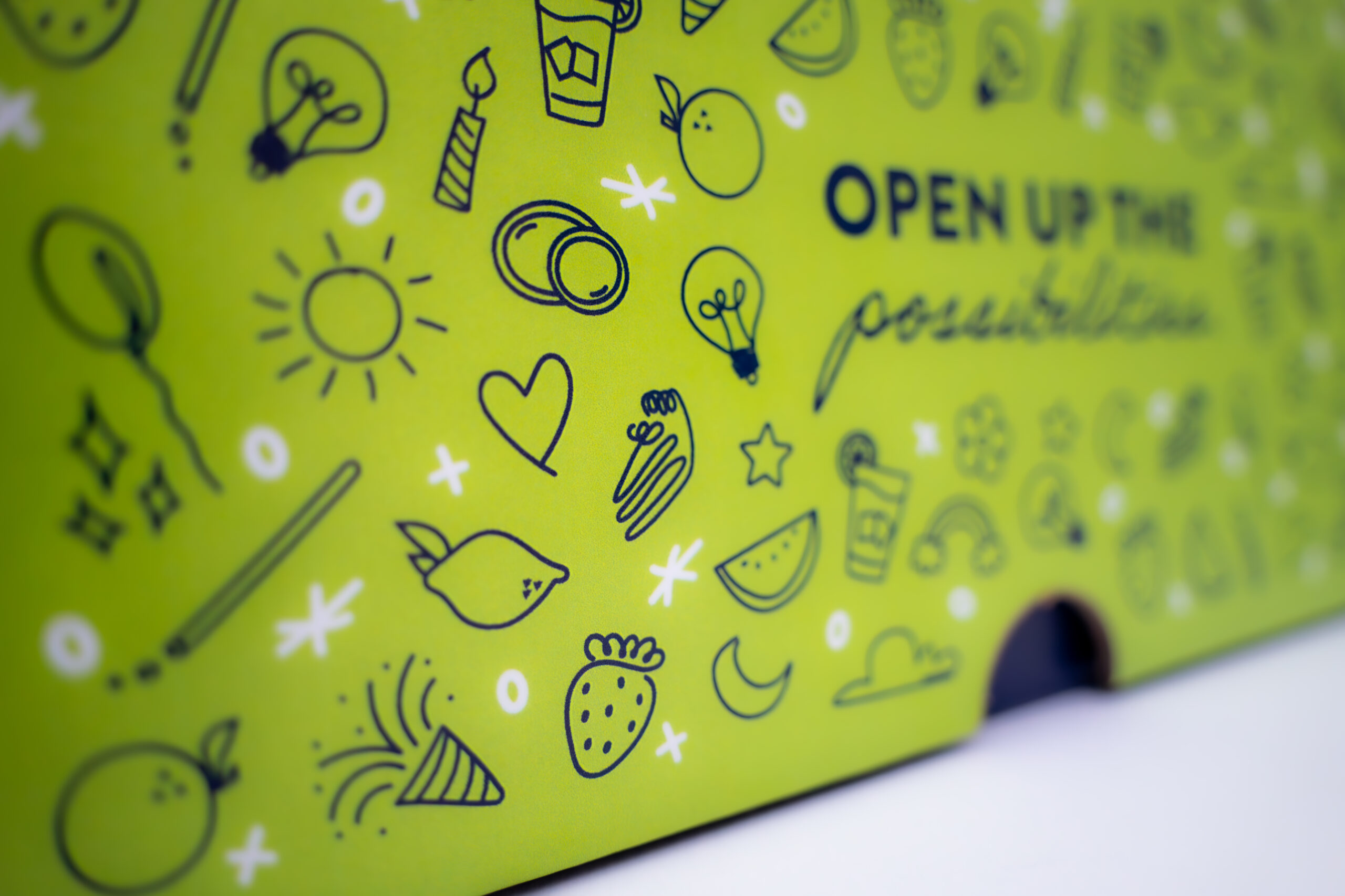
Illustration
Print
Influencers
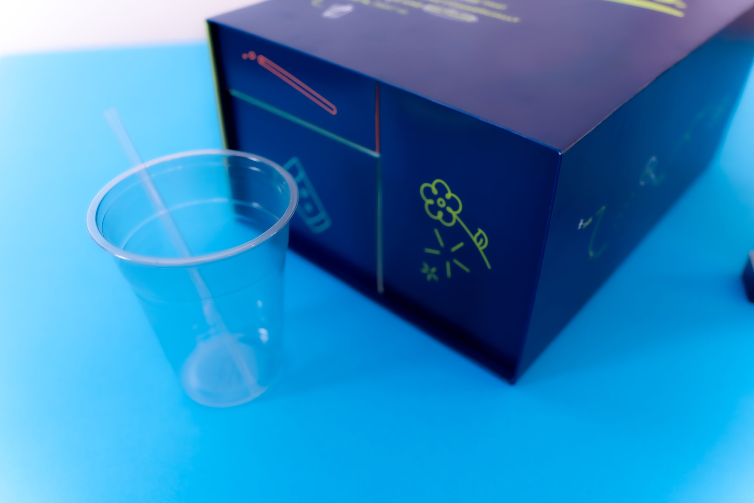
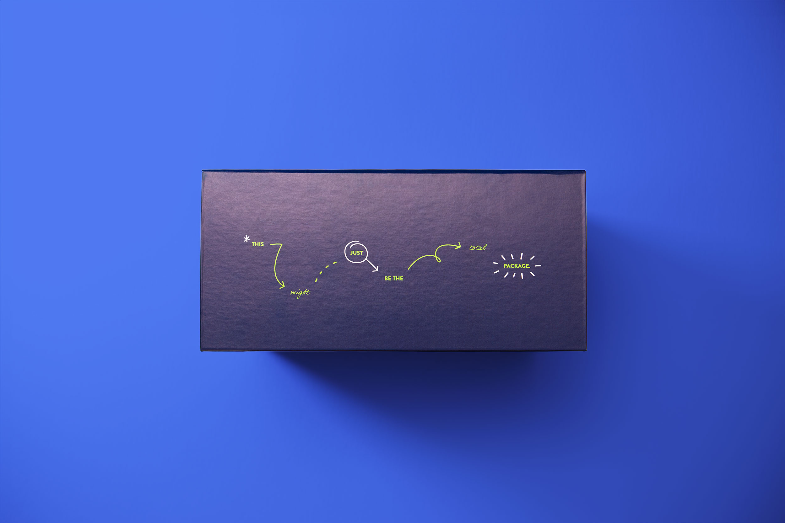
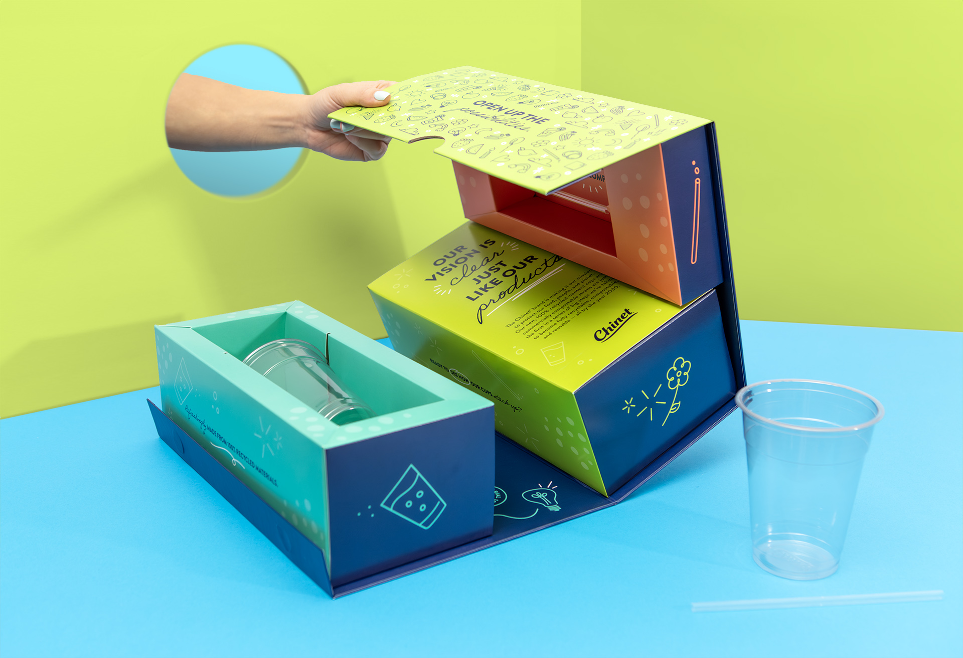
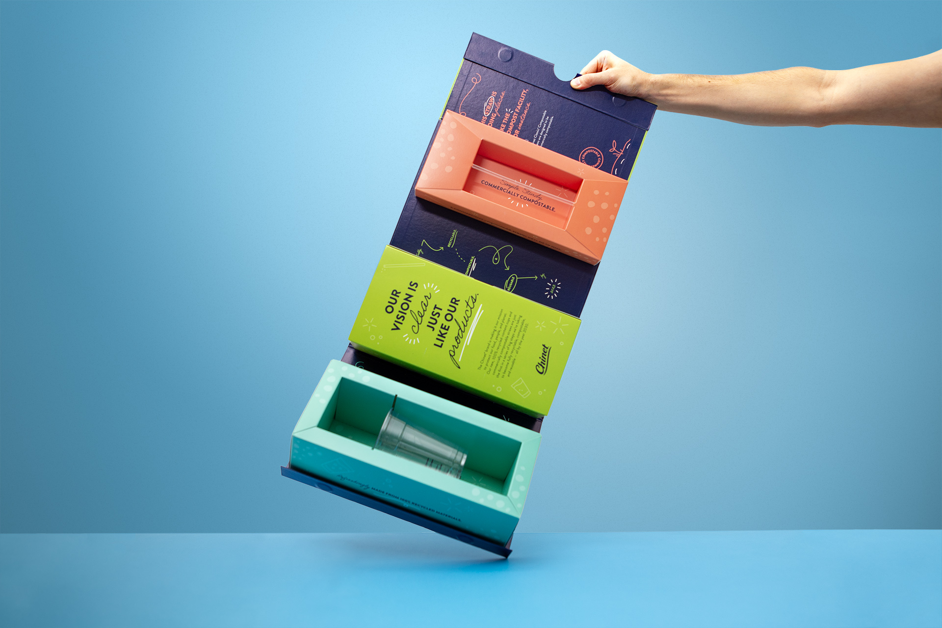
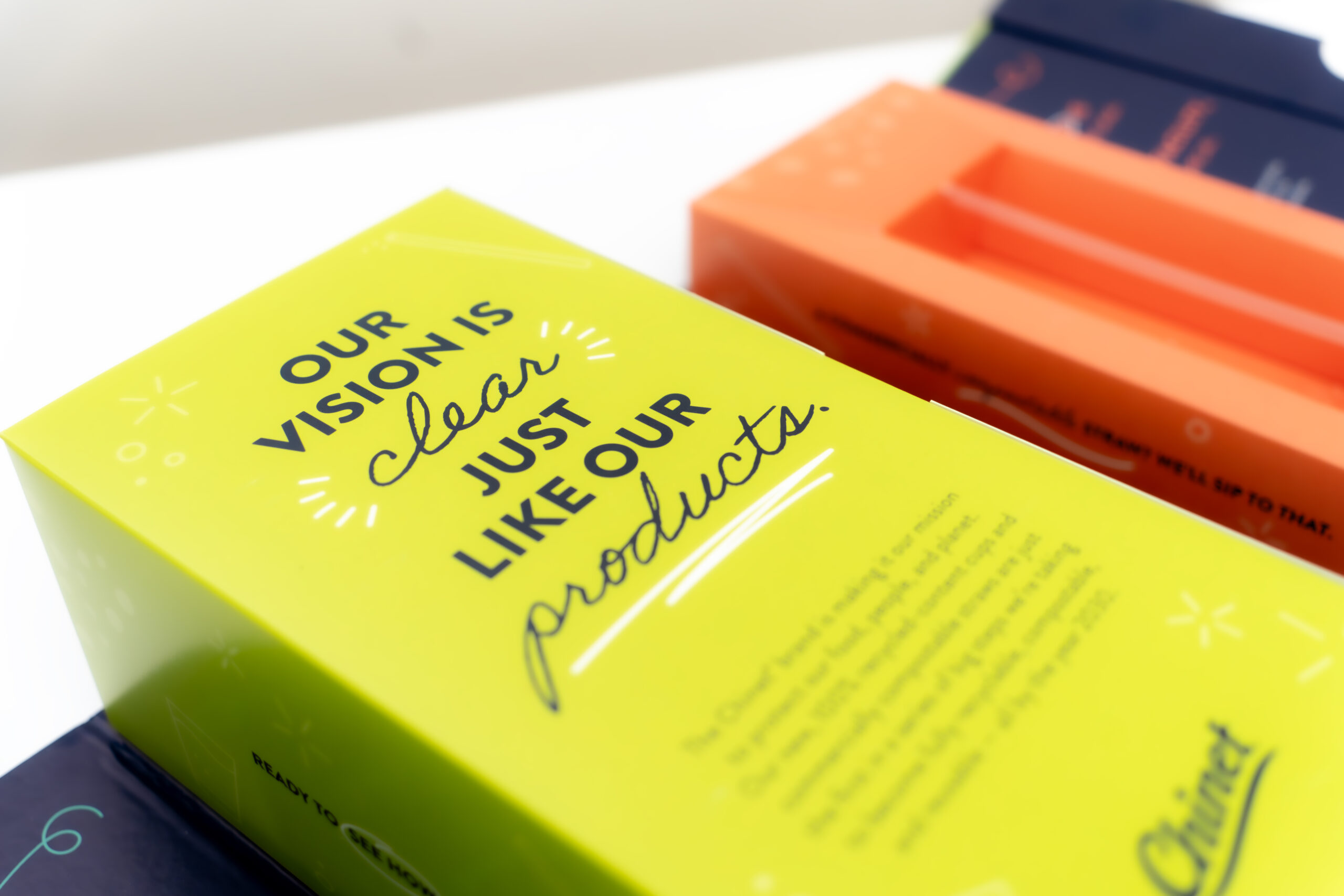
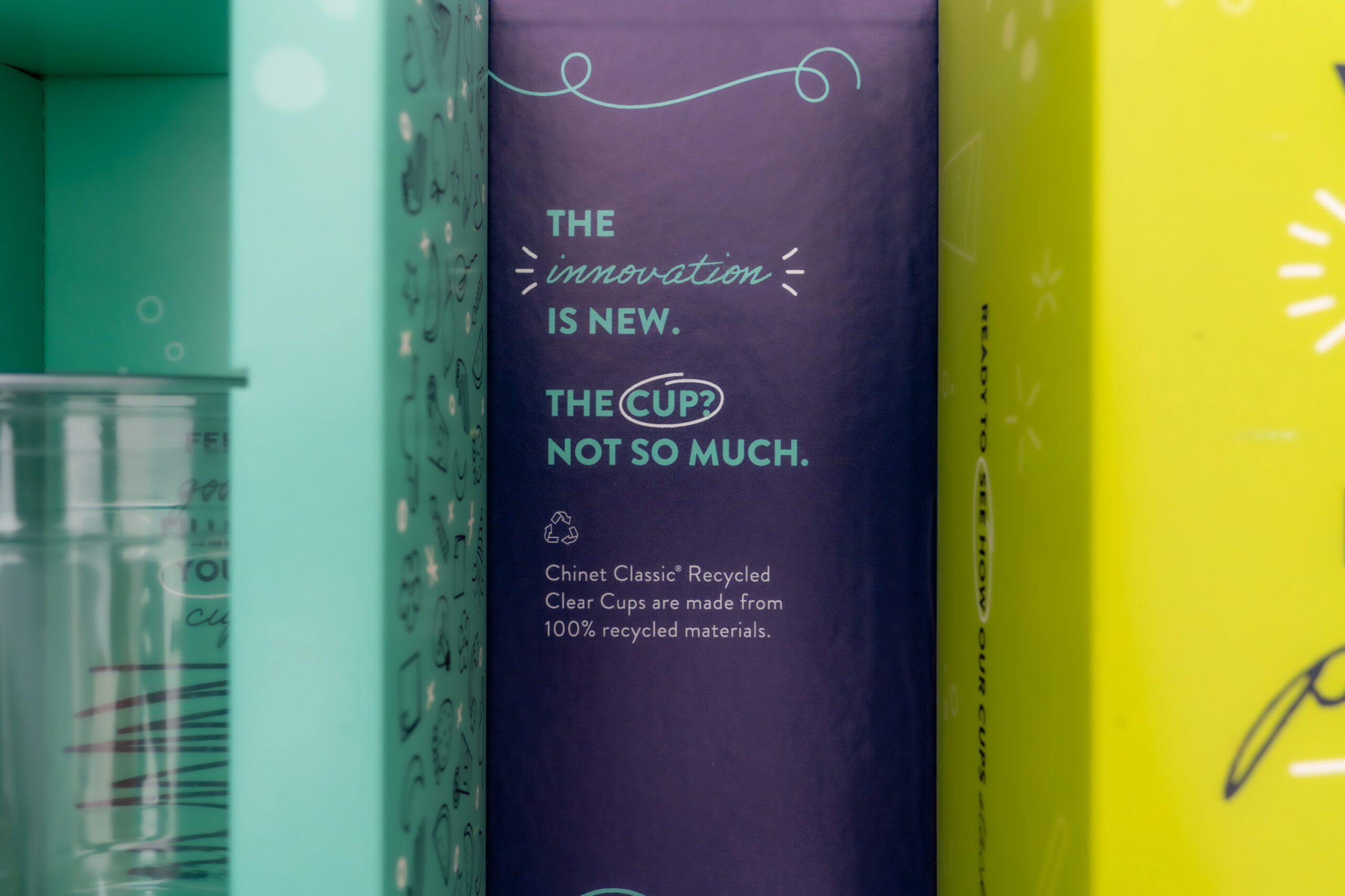
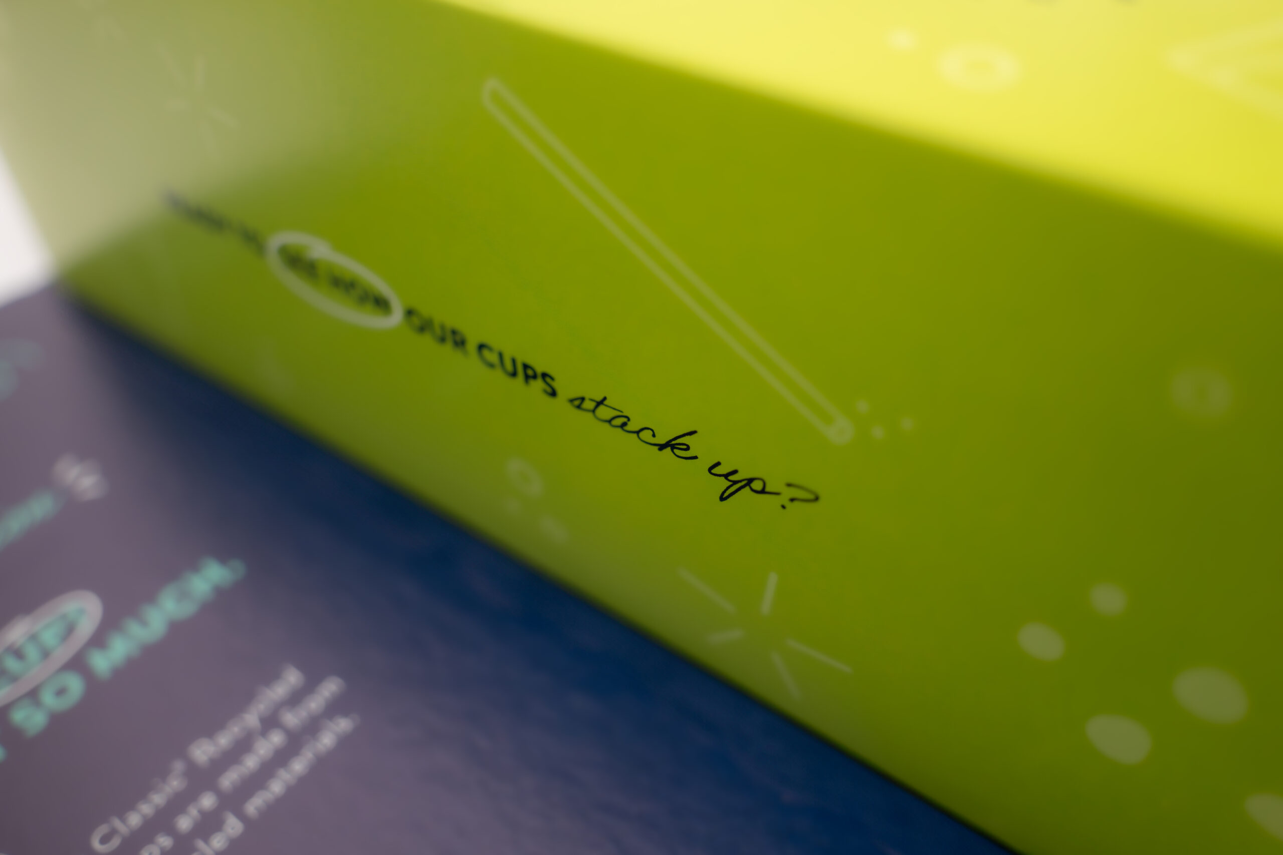
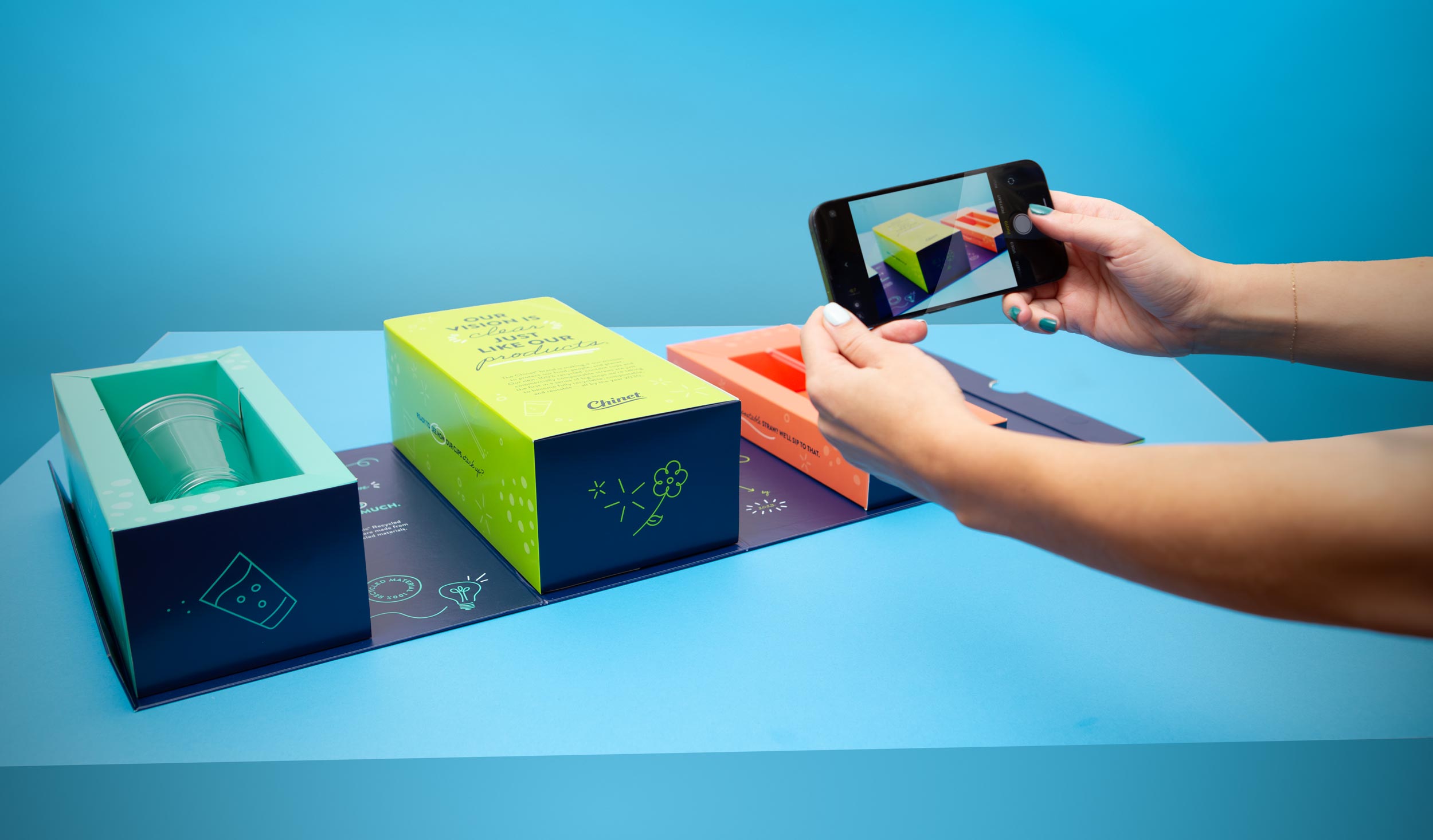
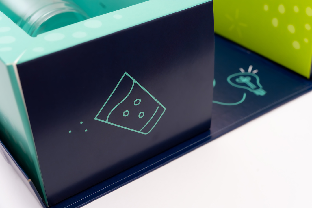
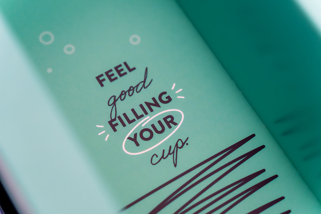
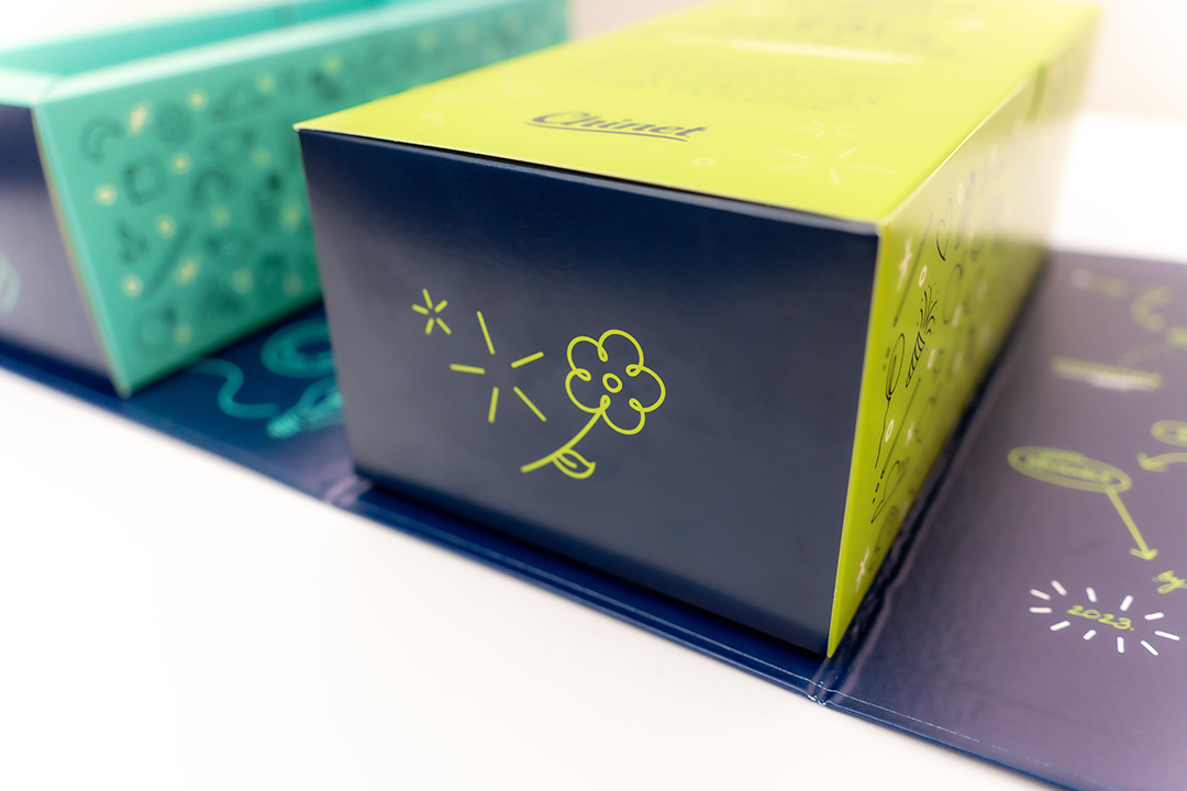
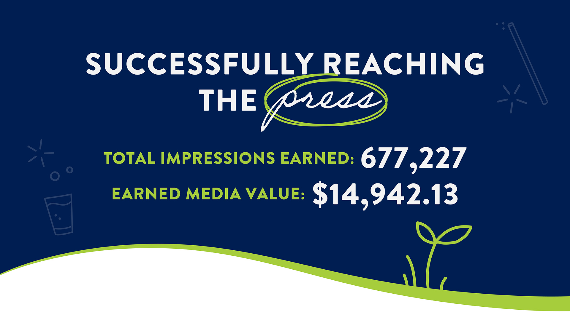
An inside the box product launch.
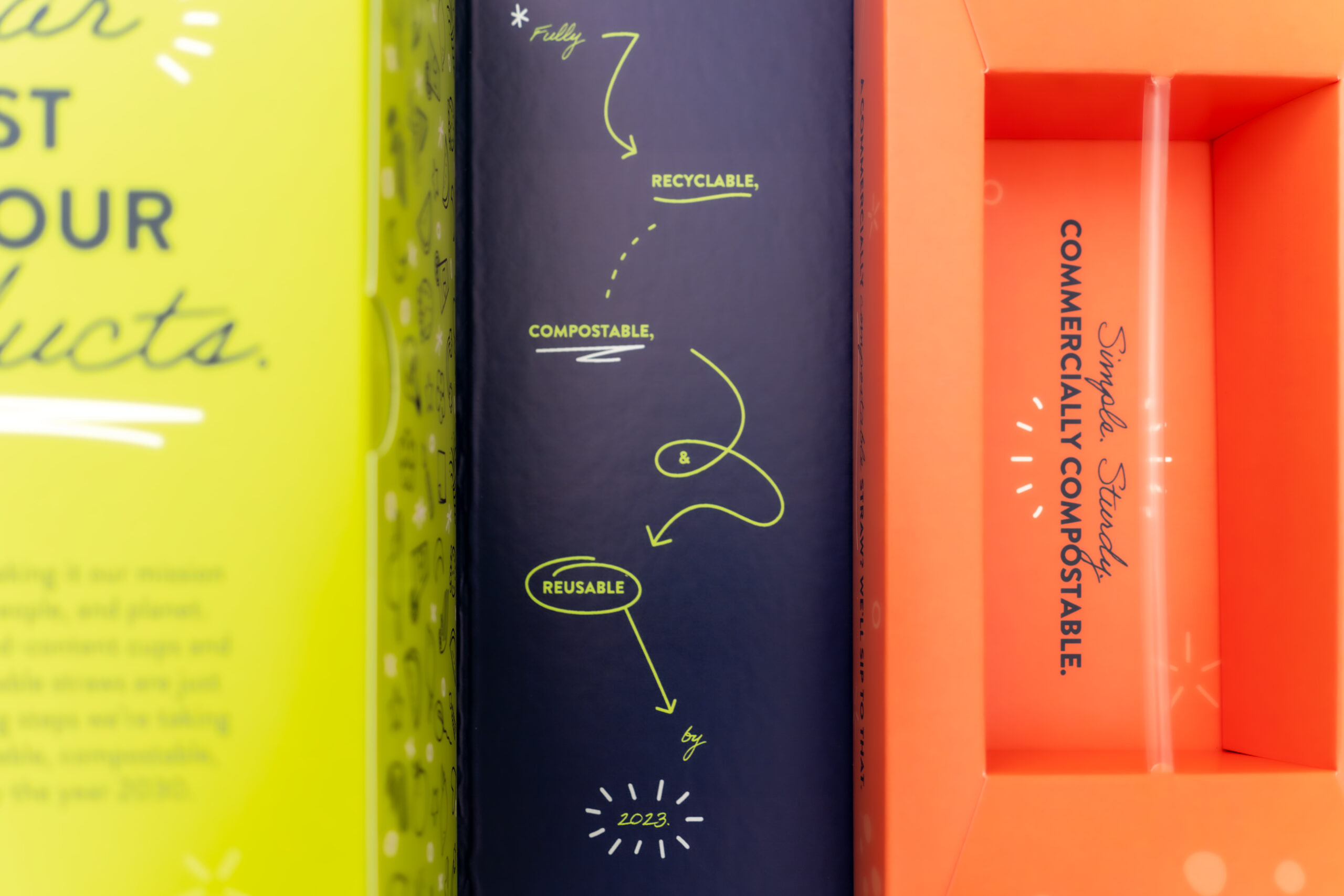
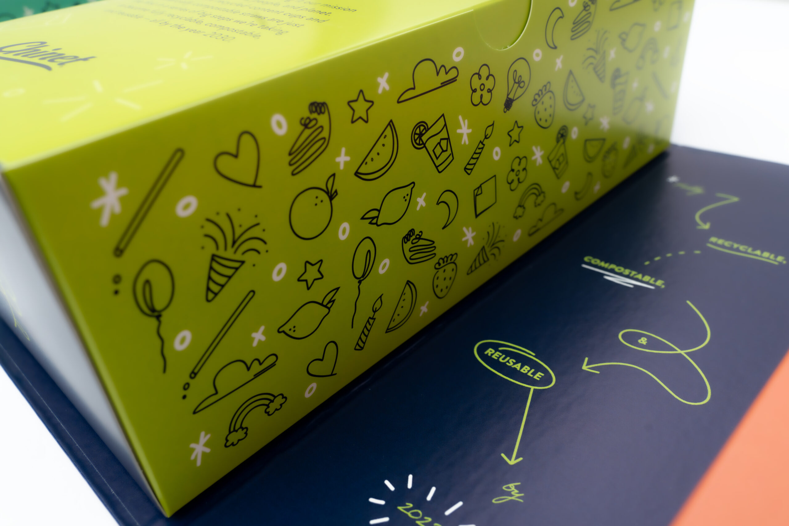
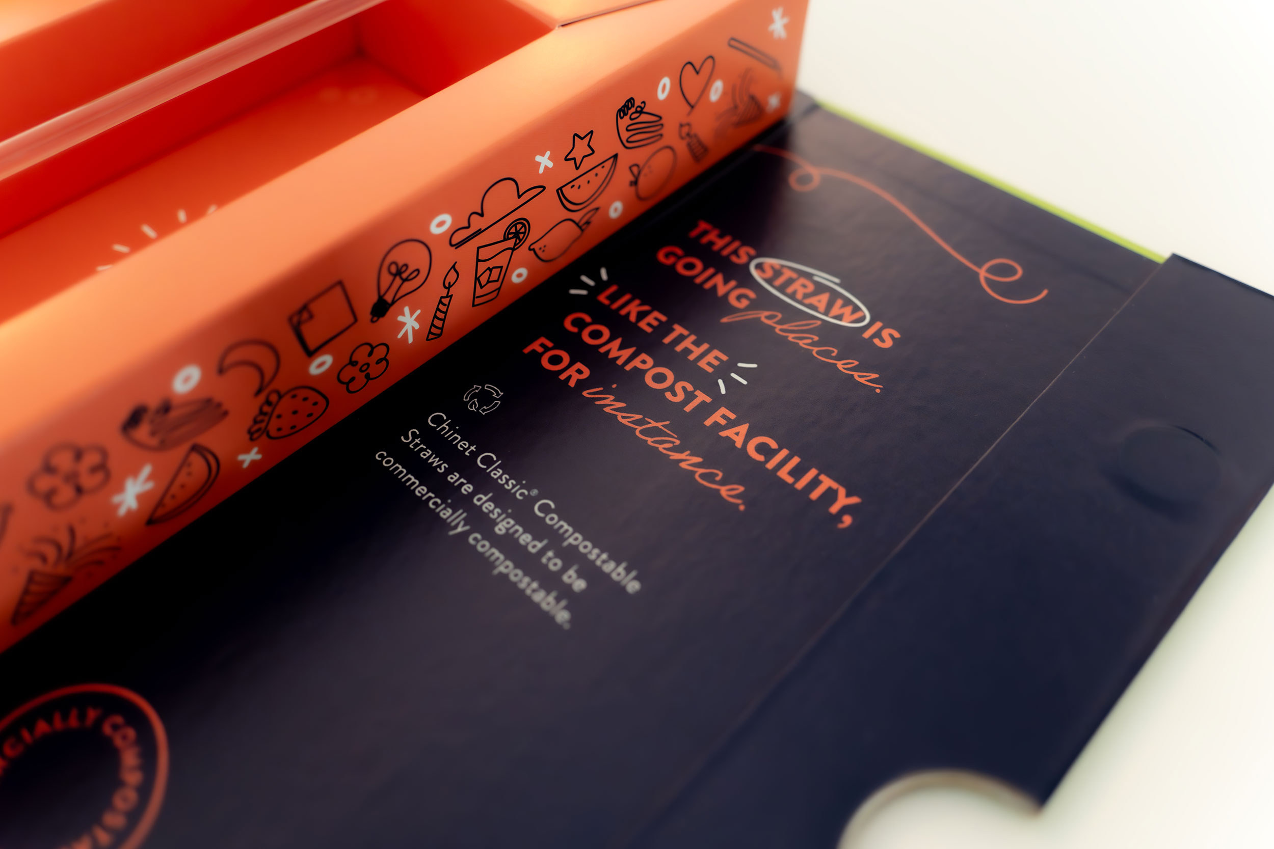
When MBB was tasked with getting media excited about the Chinet® brand’s new cup and straw, our creative team said, “Hold my Chinet Classic® Recycled Clear Cup.” While we were confident that the product’s features and benefits spoke for themselves, getting the media’s attention long enough to listen was going to be a challenge. Moreover, the new product launch was more than just an additional cup and straw on the shelves. It was an important step in the sustainability journey for the Chinet® brand. This announcement needed to allow for a story to be told and in a format that would quickly pique interest. And so, a press box unfolded.