Imagine you’re in a crowded party and you have to introduce yourself to people you’ve never met. Now imagine you only have someone’s attention for only one second, and you can only tell them about yourself with a single, carefully chosen word. This is the daunting task of creating a clear logo that will simultaneously grab attention and define a brand. The clearer this communication is, and the less complicated the design is to achieve it, the stronger a logo is. The stronger a logo is, the less refinement it will need as time goes on. Many of the strongest, most recognizable logos have remained untouched for decades since there is so little that could be improved upon.
There are several basic types of logos, all of them valid and perfectly acceptable manifestations of strong communication. We’ll be taking a look at these essential categories and some examples of strong, lasting logos in each of them.
Pictorial

Pictorial logos are those that represent something. They are a picture of an animal, a tree, an arrow, a flower – anything. They can be a natural representation of the brand they stand for, or seem a little mysterious as to why they serve the role that they do.
The World Wildlife Fund® has a strong, pictorial logo that serves as an intuitive face for its brand. The giant panda is a visually striking animal with its distinct markings of sharp black and white. The execution is pulled off brilliantly with its use of negative space. Just filling the black areas of the panda’s fur and leaving the rest void is a perfect example of saying the most with the least.
The choice of an endangered species, one that the WWF® fights to protect, is a beautiful and intuitive choice.
Apple®, on the other hand, isn’t so intuitive. What does an apple have to do with computers and phones? Nothing, really, and the amount of theories regarding why the common fruit was chosen is legendary. Some say it represents the final meal of Alan Turing, the inventor of the computer, while others say it represents the fateful forbidden fruit of knowledge in the Garden of Eden story. Most say it was simply Steve Jobs’ favorite fruit, specifically the Macintosh variety.
Origin aside, the simplicity and iconic status of the Apple® logo is almost without compare. It represents the tech company, its values and philosophy, and the people who align with that image. People sport Apple® stickers on their cars and backpacks even if they don’t own any of their products.
Lettermark
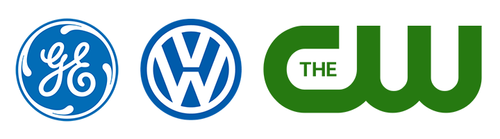
These logos are most often seen with brands whose names are an acronym. On the one hand, they don’t have the luxury of playing with the meaning of an actual word, but on the other hand, they have ample freedom to play with the shape of the letters and the relationships between the individual letterforms.
General Electric® uses the flowing curves of their script letters to create something elegant and beautiful, while the angular connectivity within the Volkswagen® logo gives a strong, clean composition that’s unmistakable.
Wordmark
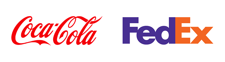
These logos utilize a word or name. Unlike lettermarks, wordmark logos have a greater priority in legibility. This is particularly true for brands with names that aren’t in the common vernacular, like Coca-Cola®. Though they made their wordmark clear and readable, they didn’t spare on the flow and flourish that gives their lettering such distinction.
The same can be said of FedEx®. There aren’t many logos more clear and readable than the one plastered on their delivery trucks. In stark contrast from Coca-Cola®, FedEx® went away from a flourishing script for their font, instead opting for custom-made, geometric letters that are readable in an instant. Going this route enabled them to cleverly hide an arrow between the “E” and “x”, a subtle indicator of their speed and forward-thinking. FedEx® is a perfect example of how, very often, strong logos are strikingly simple.
Abstract
Abstract logos can be beautiful, striking, and simple, and they’re not even portraying anything! When a client has an abstract idea of what they want to convey in their logo—“I just want it to have… energy!” or “It needs to stand out”—often what they’re looking for isn’t coming to mind because the solution that will work best for them is itself abstract.
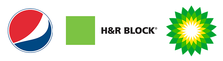
Can anyone really say what the Pepsi® logo is? Or what the H&R Block® logo really represents? These logos rely heavily on the visual punch they have without worrying about a clever concept. They’re memorable, bold, and appealing—everything a strong logo needs to be.
Emblem
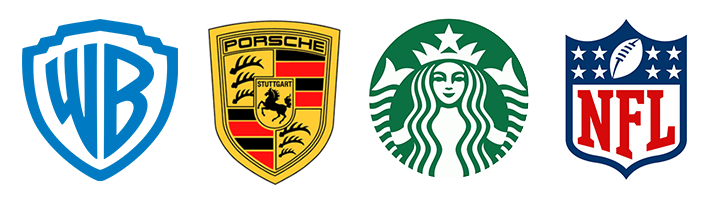
The last group we’ll discuss hearkens back to the crests and seals of old. Emblem logos are strong, usually symmetrical, and are mostly seen with brands that have a certain stately quality. The Warner Brothers® logo, for example, has been refined many times over the years, but they’ve always retained the strong “shield” shape and their imposing letters within it. When the logo appears before any sort of production —from a Bugs Bunny short to Empire of the Sun— it fits. That’s strength.
The logo for Porsche® is the combination of two actual crests, the crests of Wurttemberg and of Stuttgart, but has been refined and molded through time to be a more simplistic incarnation of those old symbols that is recognized and envied the world over. Maintaining a simple, three-color palette and the repetitive antler motif gives it ornamentation and texture without overcomplicating the composition.
These are not all the kinds of logos out there, but most strong logos you’ll see will fall into one or two of these categories. You see, the strength of a logo is larger than its manifestation. Great logos are clear, simple, memorable, and communicate something about the brands they represent. Whether you want your name to be readable and distinct, the object of your passion clearly seen, or you just want “something with energy,” a strong solution for your logo is possible. The journey is made easier by a skilled professional who knows how to find the soul of a brand, then gently carve away all the extra layers and everything that isn’t needed, isn’t essential, until the beating heart of the brand is clearly shining for all to see.
At MBB+, we love the opportunity to help brands develop a new logo that truly represents them. If you’re in the market for a new look, drop us a line.
Subscribe to our newsletter
Get our insights and perspectives delivered to your inbox.