Imagine with me, if you will, that toothbrush you use every day. It’s made using a mold, simplifying production so a manufacturing company can crank out thousands of those things in no time at all. Maybe they will make different colored handles or add different bristles, but it’s still a toothbrush created from the same old mold.
A lot of websites today also look like they have been created from the same old mold. They have the same layouts using the same fonts, and even the same photos. We web designers have frankly gotten bored with these rigid, blocky, templatey-looking website designs. It’s time to move in another direction and allow websites to tell a story as original and unique as the brands they represent.
The “Where”: Organized disorganization
Successful websites have a harmonious blend and balance of color, texture, and imagery. But what doesn’t always need to be balanced and symmetrical is the site’s layout.
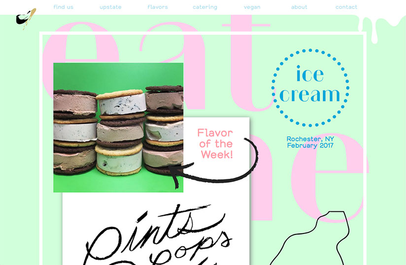
Web designs are beginning to veer off this path of symmetry where images might dominate one side of the site or design elements push off the side of the layout, creating a heavier feel on the edge they break into.
Don’t worry, all the usual suspects are still there (and need to be there for UX)—logo, headline, images, supporting copy, icons, etc.—but your logo may not appear isolated in the upper left corner, your headline may not be centered over a hero image, and your supporting copy may not be aligned neatly next to an icon.
Websites are moving toward a theme where copy, images, and design elements have become more social with each other. They may overlap, have varying amounts of padding, or be arranged more tightly than you’d expect.
This apparent disorganization is still carefully calculated per the web designer’s specifications and development capabilities. These designs can create beautiful, asymmetrical layouts that are interesting to look at and still fit within the framework of a positive user experience.
The website design, of course, needs to give way to UI and UX patterns that have become consistent standards across the web. Your site may win all the design awards, but if your users can’t use it, what’s the point?
The “What”: Expect the Unexpected
Not only are the layouts becoming more organic, but what the layouts consist of is also evolving.
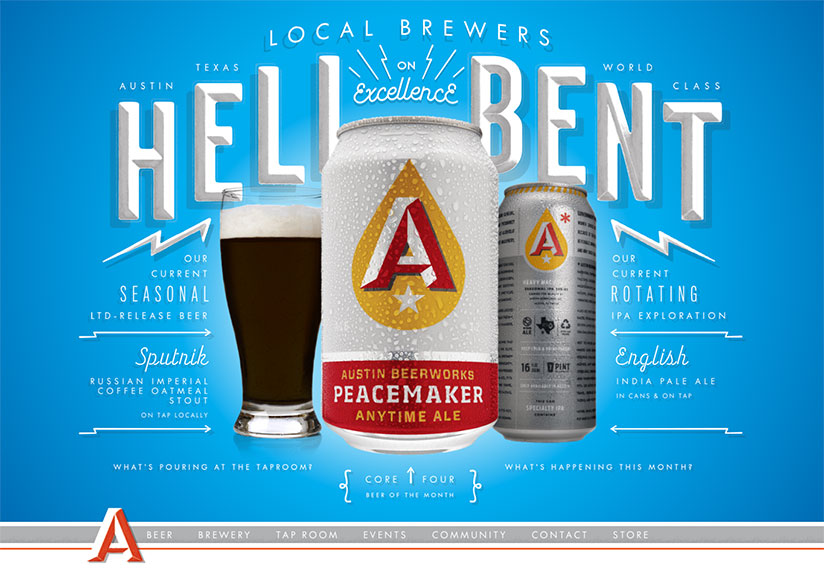
A trend to look for is imaginative, integrated headlines. Instead of headlines merely centered over the top of an image, for example, look for headlines to be the image, part of the image, or somehow creatively interacting with an image. Also, look for headers to be big in size—like, really big. And, since more and more fonts are becoming web friendly, those big headlines will be appearing in more experimental typefaces. Move over, Open Sans and Roboto!
Shapes are appearing more frequently on websites as well. I hated geometry in high school, but I love the geometric shapes and patterns that are increasingly included in web designers’ layouts. These elements may have a purpose in telling a story or be present for no particular reason at all other than to be eye candy. Sometimes it’s nice to just design for the sake of design and not have to worry about a reason for including something.
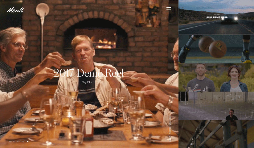
The use of stock photography has gotten incredibly prevalent. However, there is a positive shift for the use of original photography.
Stock photos can quickly create a stale site that users can see right through. A model might appear as a doctor while a user is booking an appointment on one site and a car salesman on another as the same user shops for a new car. I don’t know about you, but I don’t want my doctor selling me any cars.
Imagery created specifically for the audience of your website and for your brand is way more impactful than canned photos. Original photography gives a level of authenticity stock photography can never, ever achieve. BONUS: you can control the styling of those photos as well to make your site cohesive.
The “How”: I like to Move it Move it
We have our unique layout and some interesting images and design elements. But let’s not stop there.
Websites are using more animation and original video. Neither of these is new, of course, but they are trending to be used in different ways and for different purposes.
In a world where users share and view YouTube videos on a daily basis, it’s only natural we would see this incorporated more in web design. The moving imagery, whether in videos, gifs, or animated design elements, is an engaging way to hook users and even help them navigate deeper into your website in ways that static sites aren’t able to do.
Mini-interactions, such as button hovers, navigation menu reveals, or scrolling animations, are not only great ways to bring your site to life, they can even be informative. They can be used to aid in the telling of your brand’s story and give users an alternative way to digest content.
Videos and animations often get the message across better and quicker than text can, and— let’s face it—too many words make users’ eyes glaze over, at which point they lose interest and ultimately navigate away.
So don’t let your website become just another toothbrush. Web design is constantly evolving, and it can be hard to keep up with what’s in and what’s out. Usability is the most important, but a killer website design is going to add a lot of value to your brand and just make the World Wide Web a better, more beautiful place to hang out.
Subscribe to our newsletter
Get our insights and perspectives delivered to your inbox.