Imagine this: it’s Friday night, and after a long workweek, you’re trying to quickly order dinner for your family. You find a local Italian restaurant online and try to add spaghetti with meatballs to your cart. You click the button—nothing happens. No feedback, no visual cue. You click again, and suddenly, there are eight orders in your cart, leaving you confused, frustrated, and even hungrier.
Now what? Do you risk more frustration with their clunky interface or ditch the site entirely? If the website can’t even confirm adding an item to your cart, are you really going to trust it with your credit card? This frustrating scenario underscores the importance of microinteractions—those small but essential design details that guide and reassure users.
So, What Are Microinteractions?
Microinteractions are subtle, small, targeted moments of interaction that enhance usability and provide feedback as a user navigates and interacts with an interface. Microinteractions aren’t just cute fanfare—they’re essentially psychological hacks dressed up as design features. They make users feel smart and in control without them realizing it. And you may be surprised to hear—though by definition they’re small in nature, when it comes to the big picture, they make a big difference. At their core, they tap into basic human needs: predictability, validation, and even a dash of dopamine. And at the heart of all microinteractions is building your trust. More on that below.
The Psychological Impact of Microinteractions
Microinteractions are less about design flair and more about managing user expectations, soothing frustrations, and creating tiny moments of joy to keep people hooked. Essentially, these tiny animations and feedback loops exploit our need for instant gratification and validation, reducing the mental energy required to figure out what’s happening. Psychologically, they do the heavy lifting of reassuring users that “Yes, you clicked the right button,” or “No, this form isn’t broken, you’re just bad at typing.” They trick us into thinking the system is more responsive, more human—even when it’s not. A little animation here, a progress bar there, and suddenly users feel like everything is seamless and intuitive. Think of microinteractions as the digital equivalent of nodding along in a conversation to make someone feel heard—effective, simple, and reassuring. It’s usability wrapped in a bow of clever, harmless persuasion. And honestly? It really does work.
Let’s break down the psychological impact of microinteractions a bit more:
Predictability: Uncertainty Is the Enemy
Humans are control freaks, especially online. If you hover over a button and absolutely nothing happens, your brain doesn’t just wonder—it spirals. “Is this broken? Did I miss something? Or is this site just straight-up garbage?” Cue the frustration and eventual rage-clicking. This is where microinteractions come in to save the day. That tiny color change, bounce, or glow when you hover over a button? It’s like a small lifeline for your brain. It says, “Relax, you’re doing it right. Keep going.” These tiny cues aren’t just helpful—they’re essential. They turn uncertainty into confidence and keep people from abandoning your site in a fit of digital despair.
Validation: Digital Ego Boosts
Validation is the secret sauce of good UX. When a button expands, a field lights up green, or you see that oh-so-satisfying checkmark, it’s not just functional—it’s feeding your ego. “Look at me, I entered my email correctly! Look out, world!” Think of these microinteractions as tiny digital cheerleaders, making you instantly feel smarter and more capable. Users get that dopamine hit of success while the interface quietly guides them in the right direction. Less frustration and fewer errors. It’s not just good design—it’s a sneaky psychological win-win that keeps everyone happy, even if all you did was click a button.
A Dash of Dopamine: By Design
You know that little heart icon that bursts into a delightful explosion of color when you tap it? Yeah, that’s not just for fun—it’s engineered joy, a tiny psychological reward carefully crafted to keep you glued to the screen. It’s the same principle that makes slot machines so addictive: just enough of a reward to keep your brain asking for more. The trick is subtle but effective. That split-second burst of animation releases a hit of dopamine, and suddenly you’re not just liking a post—you’re enjoying the act of liking it. Before you know it, you’ve clicked a dozen hearts, maybe even scrolled further than you meant to, all because that little animation made it weirdly satisfying. It’s a clever way to hold your user’s attention span for as long as possible.
Trust: It’s in the Feedback
Building trust online isn’t about grand gestures—it’s about putting your audience at ease and keeping them from panicking. Subtle feedback like loading animations, progress bars, or smooth transitions don’t just look nice; they’re your site’s way of saying, “It’s all okay. I’ve got this.” Users don’t sit there marveling at your design genius; they’re just relieved your site isn’t broken. It’s a sneaky little move that buys users’ patience while simultaneously reassuring them they’re on the right track. Because let’s face it—if your interface makes people feel lost or second-guess what’s happening, they’re gone. But if you’ve thought enough about their comfort to add those tiny touches, they’ll trust you to handle the big stuff too. It’s not flashy, but it’s the foundation of keeping users from bailing mid-scroll.
Small But Mighty: 5 Practical Examples of Effective Microinteractions
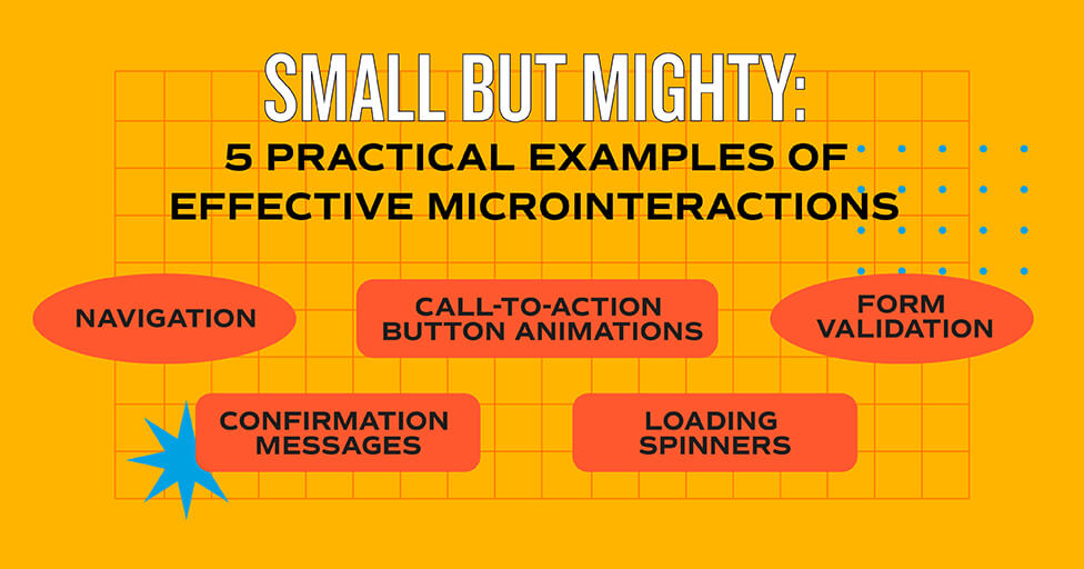
- Navigation: Highlighting active menu items or adding smooth drop-down animations are solid microinteraction moves. Why? Because they spoon-feed users exactly where to go, boosting their confidence while subtly saying, “Don’t worry; we’ve got this. Just follow the breadcrumbs.” It’s clear guidance wrapped in a tiny bit of flair.
- Call-To-Action Button Animations: Buttons light up, ripple, bounce, or change color when you hover over them, and you can almost hear them whispering, “Yes, I work. Click me already.” It’s just reassurance for our overwhelmed, easily distracted brains. You’re encouraging engagement by signaling interactivity.
- Form Validation: Green checkmarks or error messages that pop up as you type. They’re either patting you on the back or pointing out you don’t know how to spell your own email address. Your interface is basically telling your users, “You can trust me. I know what I’m doing, and I’m here to help guide you.” Forms can quickly turn frustrating, so the less friction and the smoother the usability, the better.
- Confirmation Messages: Confirmation messages are the digital equivalent of a thumbs-up after a job well done. Whether it’s “Your payment went through!” or “Message sent!”, these little notes exist to reassure you that your $50 didn’t vanish into the digital ether. Without them, you’re left staring at the screen, wondering if you should hit refresh or start drafting a customer service complaint. They’re not extravagant, but they prevent a ton of unnecessary stress by saying, “Yes, it worked. Calm down.” Simple, effective, and just enough to keep you from losing faith in technology.
- Loading Spinners: A little spinning circle that screams, “I’m working, I promise!” It’s a lifesaver for your users’ patience. The core principle at work here is reducing the anxiety of your audience. Psychologically, it’s like handing users a cup of tea during a crisis—it calms their nerves and keeps them from abandoning your website because at least something is happening.
A Few More Common Microinteraction Examples
- Breadcrumb Navigation: A trail of links showing where you’ve been, saying, “Don’t worry; you’re not lost.” Within larger interfaces or websites, these are vital.
- Tooltips: Hover over an icon, and a little box appears to explain it. Who doesn’t like a helpful, unobtrusive little visual cue? Tooltips can work well in a number of scenarios.
- Error Animations: Shaking fields or subtle buzzes when you mess up, as if the website is saying, “Nope, try again, genius.” Simply put, they’re just plain helpful.
- Progress Bars: Those satisfying bars that crawl across the screen, tricking you into thinking you’re achieving something while the system buys itself time.
- Notifications: A little red dot or number badge to remind you there’s always something demanding your attention. FOMO disguised as helpfulness.
- Toggle Switches: Sliders that flip on or off, giving you a moment of power, like you’re controlling something important. (Because why not?)
- Heart or Like Animations: Tap a heart, and it explodes into fireworks or bursts of color. It’s digital confetti for your fragile attention span.
- Sound Feedback: Subtle clicks, pops, or chimes when you interact. Just enough noise to feel satisfying, but not enough to get annoying.
Best Practices in UX for Designing Microinteractions
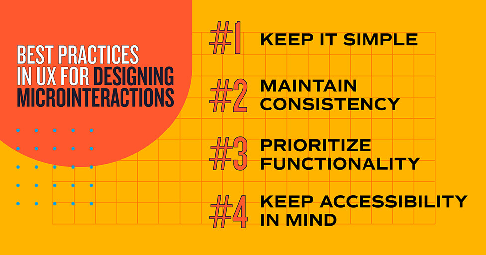
Keep it Simple
When it comes to designing microinteractions, subtlety is key. Nobody wants to feel like they’ve stumbled into a digital fireworks show just for clicking a button. Flashy, over-the-top animations that last way too long don’t impress—they annoy. Keep it simple, keep it functional, and don’t make users roll their eyes while waiting for your “creative genius” to finish playing out.
Maintain Consistency
Consistency matters, even for the tiny stuff. Your microinteractions shouldn’t feel like they were designed on a whim during someone’s coffee break. If your brand is sleek and professional, don’t throw in cheesy, cartoonish animations that scream, “Look how quirky we are!” Keep the feedback and animations aligned with your brand and design system so users don’t feel like they’ve accidentally switched to a completely different app halfway through.
Prioritize Functionality
Microinteractions need to pull their weight. If it’s not giving feedback, guiding the user, or adding a little joy, it doesn’t need to exist. Simple, right? Sometimes. No one’s here for random animations that serve no functional purpose. Focus on functionality first, because if users can’t figure out what’s happening, all the cute little bells and whistles in the world won’t save your design.
Keep Accessibility in Mind
If your microinteractions aren’t accessible, they’re basically useless for a large chunk of your audience. Fancy animations mean nothing if someone using a screen reader can’t navigate your site or if low contrast makes your cues invisible. And don’t forget the keyboard warriors—make sure they can tab through your interface without wanting to throw their computer out the window. Inclusivity isn’t a nice-to-have; it’s a bare minimum requirement.
In Conclusion: Designing for Usability & Delight
Microinteractions are the unsung heroes of good design, quietly doing the heavy lifting behind the scenes. They take the guesswork out of usability by giving users instant, intuitive feedback. Making brains happy is just a small part of it. Click a button, and it glows or ripples—congrats, you now know it worked without having to double-check, retrace your steps, or even scream at your screen. These tiny cues prevent frustration, streamline navigation, and make the whole experience feel just a little less like a chore.
Microinteractions don’t just reinforce confidence; they can also trick users into sticking around longer than they planned. And isn’t that the goal of most any interface, website, or app? But be aware: implementing these small design flourishes is the ultimate balancing act. Keep them happy, guide them seamlessly, and toss in a tiny psychological reward to make them think your interface is smarter than it really is—without overdoing it.
The next time you’re scrolling through a website or app, pay attention to those subtle touches that make everything feel smooth and intuitive. Analyze your favorite digital experiences for microinteractions—those glowing buttons, bouncing icons, or satisfying progress bars—and consider why they work (or don’t). Because nothing makes us appreciate good UX more than suffering through bad design.
Need help with your website or app’s usability?
Small tweaks can make a big impact. Reach out to us at MBB; we can help with that.
Subscribe to our newsletter
Get our insights and perspectives delivered to your inbox.
