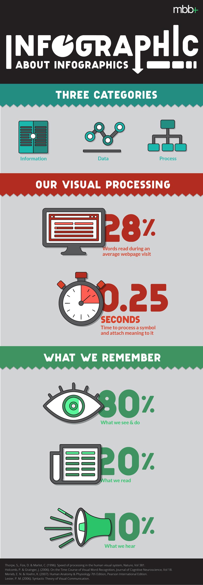
The rise of content marketing has increased the need to make content visual and memorable. Today we are bombarded with five times the amount of information we were in 1986 (1). Infographics have become an important tool to break through the clutter by making information easier to understand and digest than text alone is because it takes our brains only .25 seconds to process the meaning of a symbol to attach a meaning to it (2). For example, if you see a deer crossing sign, it takes .25 seconds to process that the image is of a deer and that the image of the deer means to be cautious of deer crossing the road.
Infographics are more than just words and numbers telling facts—they’re a way to share a story, show some authority, and hopefully create some shareable buzz. The best infographics successfully utilize visuals and copy to effectively tell a meaningful and engaging narrative while increasing retention. Research has shown that people remember 80% of what they see and do compared to just 10% of what they hear and 20% of what they read (3). This is a massive difference that shows the importance of visualization.
A quick online search will result in numerous types of infographics. There are many different types and can be categorized in different ways with a lot of overlap. But before we go into different categories, let’s first touch on what infographics are not.
Because they have become so prevalent, the term “infographic” has been watered down. An infographic is not simply any type of image or illustration with copy over it. For example, representing stats as a graphic does not automatically make it an infographic. It depends on how the information is visually presented. And although stylizing stats or imagery with cool, formatted typography can be an effective and interesting way to share your message, these are not necessarily infographics either.
When talking about what is and isn’t an infographic, lines can get blurred. But having a shared understanding of what infographics aim to do will help designers and their clients better communicate about what is needed in a project, whether that’s an infographic or a graphic in general.
Most infographics will fall into one of three main categories:
- Information: This is a broad category that includes infographics such as a lists, timelines, comparisons, or maps. These types of infographics are concepts that support or back up a specific statement. It might be something along the lines of “5 Tips to Save Money” or “The Differences between Millennials and Baby Boomers.”
- Data: These data-rich visuals often take the shape of charts and graphs. Data infographics are used to decipher numbers-heavy content and help show patterns or differences. A data infographic might be something like “Social Media Users Per Continent” or “Dow Performance over the Last 5 Years.”
- Process: Process infographics explain methods for making a decision or how something works. These are flow charts, decision trees, or how-to charts. They lead the user through a path that has a definite beginning and end. They might have different paths to the same ending or different ending points altogether. Process infographic topics might be “What Show to Binge Watch Next on Netflix” or “How to Know if You Should Buy a New Car.”
Data visualization will only continue to grow as more and more brands pursue online content. Knowing the difference between a graphic and an infographic will help you more specifically communicate your project needs and ultimately end up with the desired outcome.
And, just for fun, here’s an infographic about infographics
Subscribe to our newsletter
Get our insights and perspectives delivered to your inbox.