
Many moons ago, website design was a fairly straightforward venture: designing a website for consumer consumption meant creating a website that looked good and worked well on a desktop computer or laptop. That all changed in 2007 when the first iPhone was released. Now, users could surf the web, shop for products, watch videos, and scroll endlessly through social media networks, all on a device that fit in their pocket. It would be difficult to sum up just how much this changed the game when it came to developing user-friendly, properly designed websites.
Now, websites had to be made to work well and look nice on a wide variety of different screen sizes. Countless different types of tablets, iPads, and a plethora of phone devices – Android and iPhone – have to be considered when building a new website. You’ve probably visited a website that wasn’t mobile-friendly on your smartphone before. And, more than likely, you immediately returned to the Google search results page because, let’s face it: a website that isn’t mobile-friendly isn’t of much use to anyone on a smartphone device. The text content itself isn’t legible, completely defeating the website’s purpose in the first place.
A Growing Mobile Audience
These days, it’s pretty hard to find someone who doesn’t own a smartphone. You’d be hard-pressed to find someone who doesn’t have their mobile phone on them seemingly at all times. Now more than ever, it’s important that your company website is mobile-friendly. And with each passing year, mobile usage is increasing- a trend that’s not likely to slow down anytime soon.
The following are just a few current mobile usage statistics:
- Mobile web traffic accounts for 52.6% of all global web traffic
- Adults in the US spend an average of 2 hours and 55 minutes on their smartphones every day
- 40% of online transactions are done using a mobile device
- 80% of users used a mobile device to search the internet in 2020
- More than two-thirds of the total digital ad spend in 2020 was on mobile ads
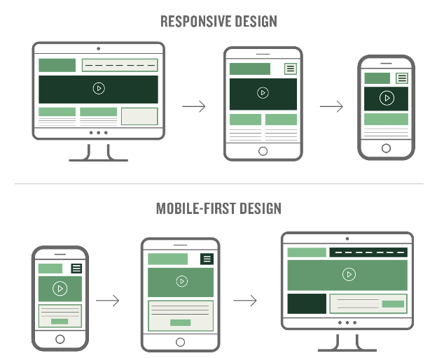
Responsive Design versus Mobile-First Design
Two approaches to designing for the web that are often confused with being one and the same are actually different: responsive design and mobile-first design. How the designer initially approaches the website design is the key difference between responsive design and mobile-first design.
Responsive Design
Responsive design begins at the maximum resolution, such as a desktop size, with elements then scaling down for smaller devices seamlessly. The overall website design is automatically adjusted depending on the size of the screen the user is viewing the website on. This means that regardless of what device they’re using, users can easily browse the website. In general, websites that are more content-heavy are better suited with a responsive design approach. Responsive websites are reactive; they change fluidly to fit the screen size the user is viewing the website on.
Mobile-First Design
Mobile-first design is a strategy similar to designing a mobile app, approaching the design from a mobile device standpoint and then adapting the layout for larger screens – like tablets and desktops – without too many modifications. Mobile-first design is more of a design strategy, whereas responsive design is more of a technical method. Instead of scaling downwards, as in responsive design, with a mobile-first design, the design scales upwards. The emphasis in mobile-first design is on providing the best user experience for the small screen. As more and more web traffic is serving a primarily mobile audience, the mobile-first design approach is steadily growing in popularity. With mobile-first designs, content must be prioritized, and navigation should be intuitive. Web designers must ensure that critical elements are displayed precisely and obviously, as those are the elements the user is searching for. The site should be designed so users can easily scan the content and shouldn’t be too text-heavy. After all, users don’t read websites; they scan them to find the information they are looking for.
By analyzing the percentage of your target audience using mobile devices to surf your site, you can decide whether to move forward with either a responsive design strategy or a mobile-first approach.
Emphasis on Mobile Optimization
Designing a user-friendly website for a mobile audience is of the utmost importance. Unclear form fields, tiny buttons, confusing or bloated navigation, annoying pop-ups, and endless scrolling often create frustration and can lead to users abandoning your website for another. People are busy and impatient. Their attention span is limited. They don’t want to have to work to access the content they’re after – they want to arrive at the information that brought them to your website in the first place in the simplest manner possible. When designing a website for mobile devices, you should keep in mind that space is limited. This means mobile sites should be streamlined: fewer functions should be available, and text content should be limited in comparison to the website’s larger desktop version. Functional elements and legibility should be paramount. If text is unreadable or images are unclear without zooming or scrolling, your website will frustrate its users.
To create a mobile-friendly website, consider implementing the following features:
- Smaller images
- Larger buttons
- Clearly emphasized links
- Easily understood navigation
- Auto-fill form fields
- Eliminate unnecessary clutter
- Proportional elements
- Faster page loading
Google Loves Mobile-friendly Websites
With more than half of all Google searches performed on mobile devices, if your site isn’t mobile-friendly, not only will it be abandoned, but it also won’t rank well. Google search ranking prioritizes mobile-friendly sites, whether it is designed as responsive or mobile-first. The better the user experience on a mobile device, the higher the search ranking. Luckily Google makes it easy for you to evaluate your website’s mobile-friendliness; click here to test a site. Google also offers an easy guide to creating mobile-friendly websites. Failing to have a site that’s easy to navigate on a mobile device means less organic search traffic.
In today’s fast-paced world, having a website that functions well across all devices is imperative. Designing a website that’s optimized for mobile devices is just as important as a content strategy or SEO integration. If your website doesn’t perform well on the small screen, you risk alienating and frustrating your end user. There’s a lot of competition online, and people have short attention spans. If your website looks and works great on their smartphone, they’re more likely to continue using it.
Subscribe to our newsletter
Get our insights and perspectives delivered to your inbox.