Landing pages exist with one sole purpose in mind: to promote one message which leads to high conversion rates. There are many elements that go into creating a successful and effective landing page, including persuasive headlines and eye-catching images.
Landing Page Basics
A landing page is a web page on a website which is set apart from the core structure of the website itself for a specific purpose. It isn’t included in the website’s overall navigation and users generally get to the landing page by targeted, organic marketing efforts, such as Google AdWords and targeted keyword searches. Landing pages are created and designed to receive and inform users about a specific marketing campaign. The focal point of any good landing page is generally a call to action, such as a lead capture form. That said, a landing page often shouldn’t offer many click-out options since the goal isn’t to navigate the entirety of the website; the goal is very specific and action-oriented.
Landing pages are created for a number of reasons and promotions. A few of these include:
- Enticing users to buy something
- Leading users to sign up for a subscription for something
- Encourage users to donate money for a cause
- Entice users to visit a physical location
- Persuade users to register for an event
- Encourage users to sign up for a free trial of your services
All of these conversion methods have one end result in mind: to convert the user to a paying customer. This is the ultimate goal of any landing page.
Core Landing Page Concepts
There are many elements to keep in mind when designing a functional and effective landing page. Because landing pages vary in their end result goals, there’s no one-size-fits-all setup. However, the same general principles apply to most landing pages. There are a few initial core concepts that should be kept in mind when designing an engaging and functional landing page:
Above the Fold Content
The term “Above the Fold” was taken from print media, such as newspapers, and the concept also lends itself well to websites and landing pages. Since newspapers were printed on large sheets of paper, the content that displayed “above the fold” needed to be attention grabbing and entice readers to delve deeper into the newspaper as a whole. So with digital content, while there may not be an actual, physical fold, the “above the fold” content applies to the browser scrollbar: that is, you need attention-grabbing content displayed in the immediately visible portion of the website. Engaging content that will entice the user to scroll below the fold, with the main features presented above the fold line. This “above the fold” content is generally thought of as being within the topmost 600 pixels of the landing page itself.
Mobile Responsiveness
With over 60% of online searches done on smartphones, making your landing page mobile responsive is of the utmost importance. This includes having text that is easily readable across all devices and targeted action areas large enough to be tapped within a mobile device. A user should not have to scroll horizontally or zoom in on your website in order to read its content. Navigating your website should be a user-friendly and consistent experience across all devices, ensuring that you reach the largest audience possible. A consistent experience increases sales, conversions and lead generation. In fact, for all these reasons, when initially strategizing your landing page layout, it might be best to approach it with a mobile-first mentality.
Limited Navigation
As stated previously, your landing page exists for the sole purpose of funneling visitors toward one specific action. Because this is the main goal of the landing page, you must design your landing page with that specific goal in mind at all times. Visitors should not be tempted to navigate to other places within your website by additional navigation elements. The actionable goal should be kept first and foremost at all times.
Key Elements Found On An Effective Landing Page
As mentioned above, landing pages are not a one-size-fits-all entity. However, for the most part, effective landing pages include the following key elements:
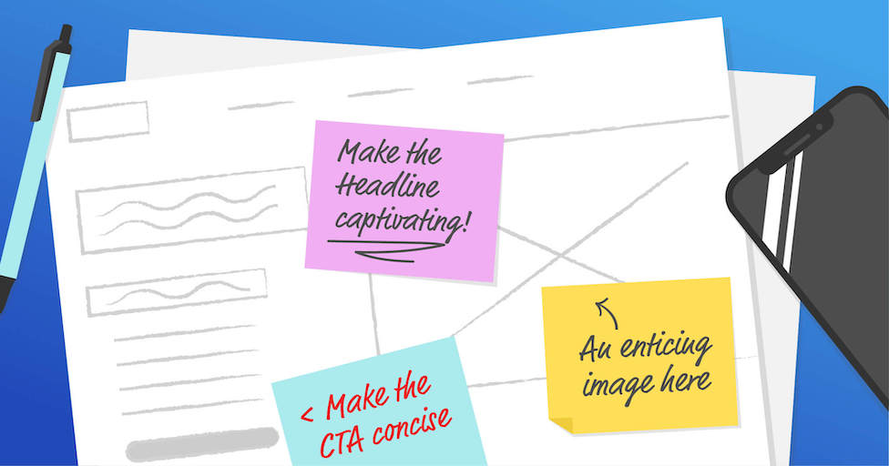
A Captivating Main Headline
Your landing page’s main headline should inform and grab attention immediately. The headline is where it all starts, so it should be strong, engaging and to the point. As the headline is what will draw the visitor in, it’s important that it is laid out in an appealing way without being too wordy. A headline should be no longer than 20 words, with ideal headlines closer to the 10-word limit.
An Informative Sub-headline
Because the main headline should be short and sweet, you can utilize the sub-headline, or supporting headline, to go more in depth about the product or service your landing page is promoting. In general, the subheadline should display just beneath the main headline and offer a slightly more in depth view of what the landing page is offering, with just a hint of persuasiveness included in the overall tone. The subheadline should support the main headline, making it clear what the landing page is offering. It should be noted that a sub-headline is not always needed, although when used in an engaging way, it usually helps cut down on the overall body copy needed to get the point of the landing page across.
Informative Body Copy and Bullet Lists
In general, people don’t read websites, they scan them. If you’ve produced an attention-grabbing headline complemented by a persuasive subheadline, your visitors will want to read more about the product or service your landing page is promoting. But users can be turned off by too much text; you don’t want to overwhelm them with a large block of copy. It should be very clear what is offered and how they are expected to interact with the landing page. Using bulleted lists to get main points across helps eliminate rambling copy blocks, instead offering the user concise, focused bits of information. Think of the body copy as a benefit-oriented summary of why the user should take the action the landing page is funneling them toward. If you make the user work to figure out what the page is offering and why they should take the intended action, you’ve likely already lost them. Clarity should be the top priority in all elements presented.
An Enticing Supporting Image
The human brain processes images at an alarming speed. For this reason, it’s important that the main image used on your landing page both compels the user to learn more about the promotion as well as triggers an emotional reaction—oftentimes, without the user even realizing it. The main image should support your headline and subheadlin, with visual relevance to the product or service you’re offering. The main image shouldn’t just be chosen to make the landing page pretty—it should communicate the value of the offer being made. Taking advantage of visual cues within the main image also lends itself extremely well to the overall landing page design. If the image’s main focus includes a person and that person’s gaze is directed toward your call to action, this helps strengthen the overall visual hierarchy of the landing page. The main image should inspire trust and build on the supportive nature of the headline, subheadline and body copy.
A Clear and Concise Call To Action
No matter what your landing page is offering, it’s important that the call to action, or CTA, is clear and straightforward. This is the focal point of your landing page, and it should be treated as such. Using a button is generally preferred: visitors know to look for a button in terms of actionable items. Button text should be focused and not vague: instead of displaying a button with generic text such as “Learn More,” you could use “Learn More For 10% Off.” This direct approach helps the user easily understand the benefit of making the action you’re persuading them to take. Using a contrasting color is a good idea; just like in a painting, the focal point needs to garner attention easily. Using color to attract the eye and direct the user is one of the easiest ways to make a CTA prominent within the rest of the landing page.
While crafting an effective landing page isn’t brain surgery, there is a definite art to it. Plotting out your strategy ahead of time is the best way to go about it. Looking to launch a new landing page? We can help.
Subscribe to our newsletter
Get our insights and perspectives delivered to your inbox.