The Chinet® Brand

Design
Illustration
Print
Influencers

An inside the box product launch.

When MBB was tasked with getting media excited about the Chinet® brand’s new cup and straw, our creative team said, “Hold my Chinet Classic® Recycled Clear Cup.”  While we were confident that the product’s features and benefits spoke for themselves, getting the media’s attention long enough to listen was going to be a challenge. Moreover, the new product launch was more than just an additional cup and straw on the shelves. It was an important step in the sustainability journey for the Chinet® brand. This announcement needed to allow for a story to be told and in a format that would quickly pique interest. And so, a press box unfolded.
The unexpected influence of “unboxing”.

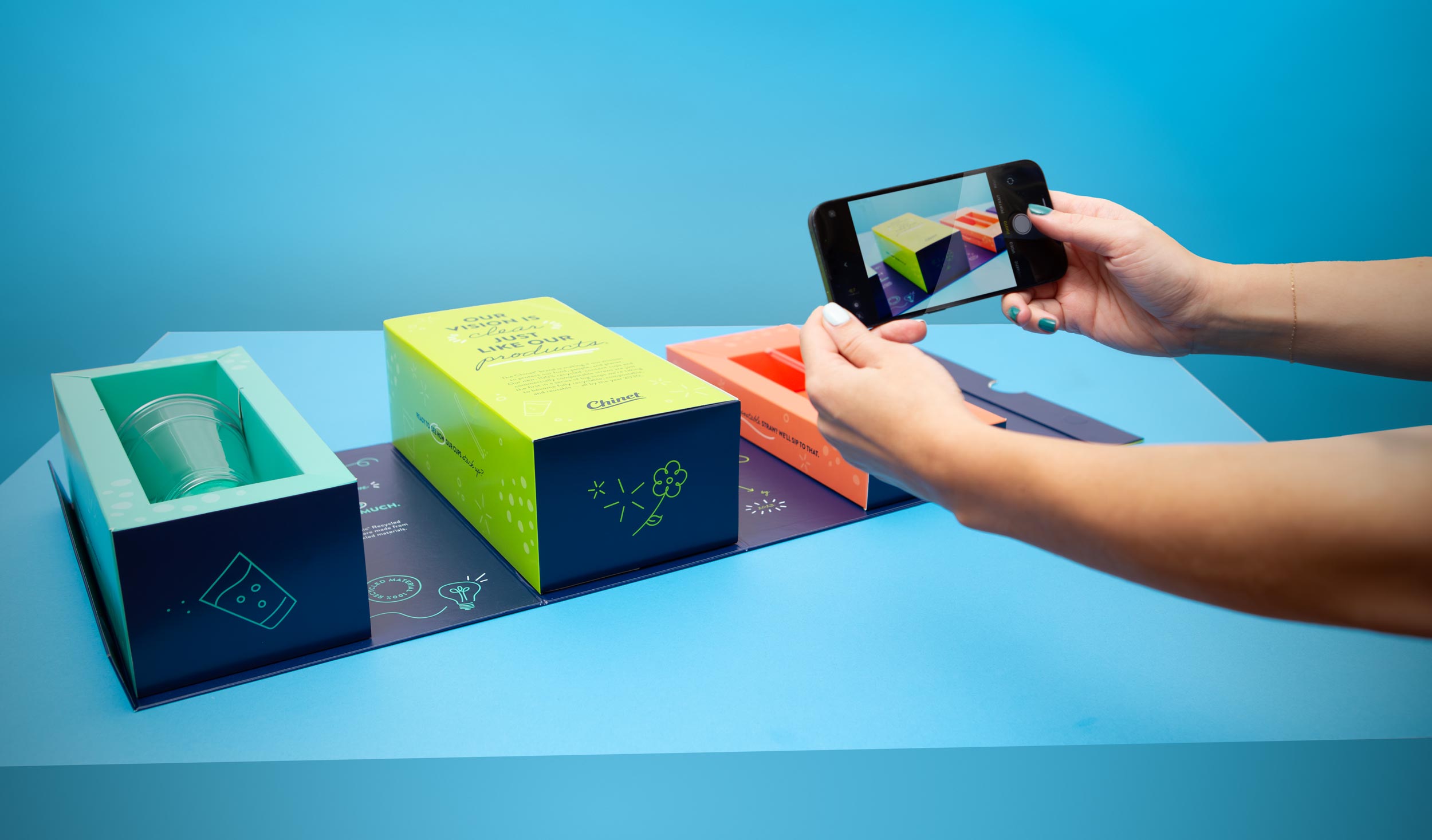
Press boxes are nothing new in the world of media. However, as influencers have gained more credibility and reach, press boxes have recently garnered more attention. Naturally, influencers turn to social media when “unboxing” their kits. The few seconds of screentime the products get before viewers scroll on means the messaging and presentation had to be on point.

More than a new product, a new step in sustainability.

The Chinet® brand is committed to using more recycled materials and putting less waste in landfills. Their new products do just that—in ways that current products on the shelves don’t. The Chinet Classic® Clear Cups were the first to market cups made from 100% recycled plastic. That means that every 32 Chinet Classic® clear cups re-uses 51 plastic water bottles, giving additional life to plastic already produced. The Chinet Classic® Compostable Straw maintains the look and feel of a plastic straw (unlike paper straws that lose 70-90% of their strength after 20 minutes of use) yet they are commercially compostable making them the best sustainability choice when hosting a party.

Designed to make an impact.

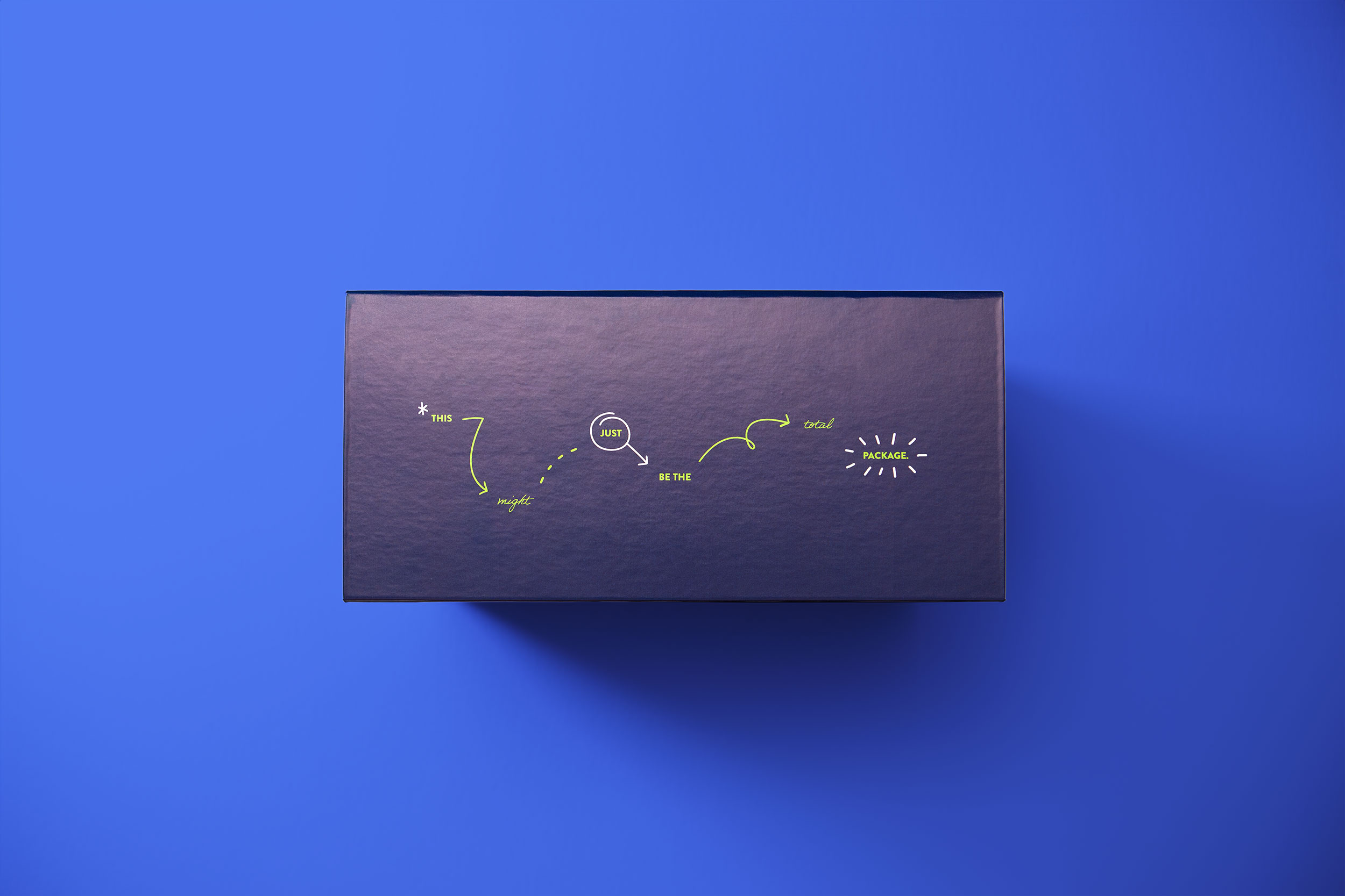
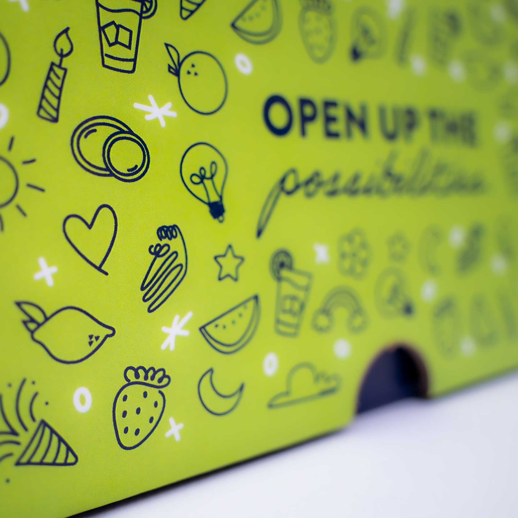
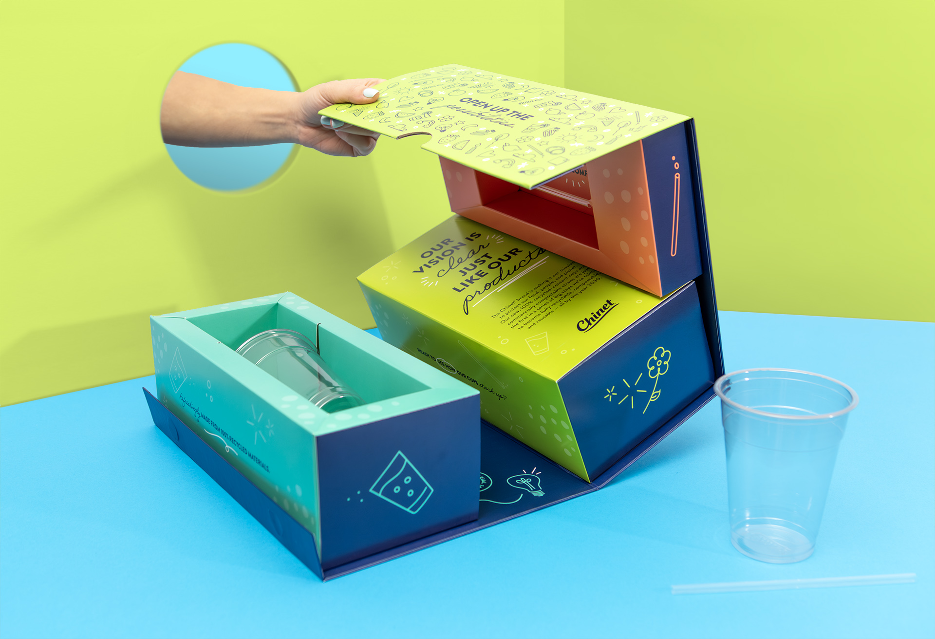
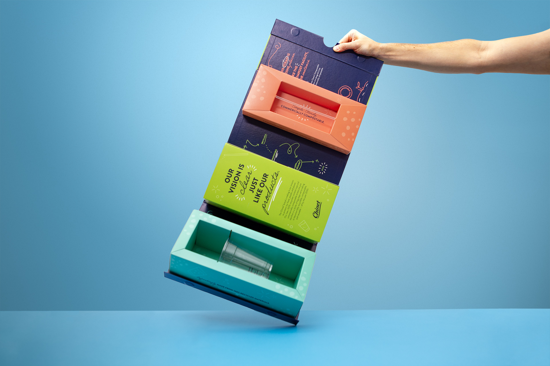
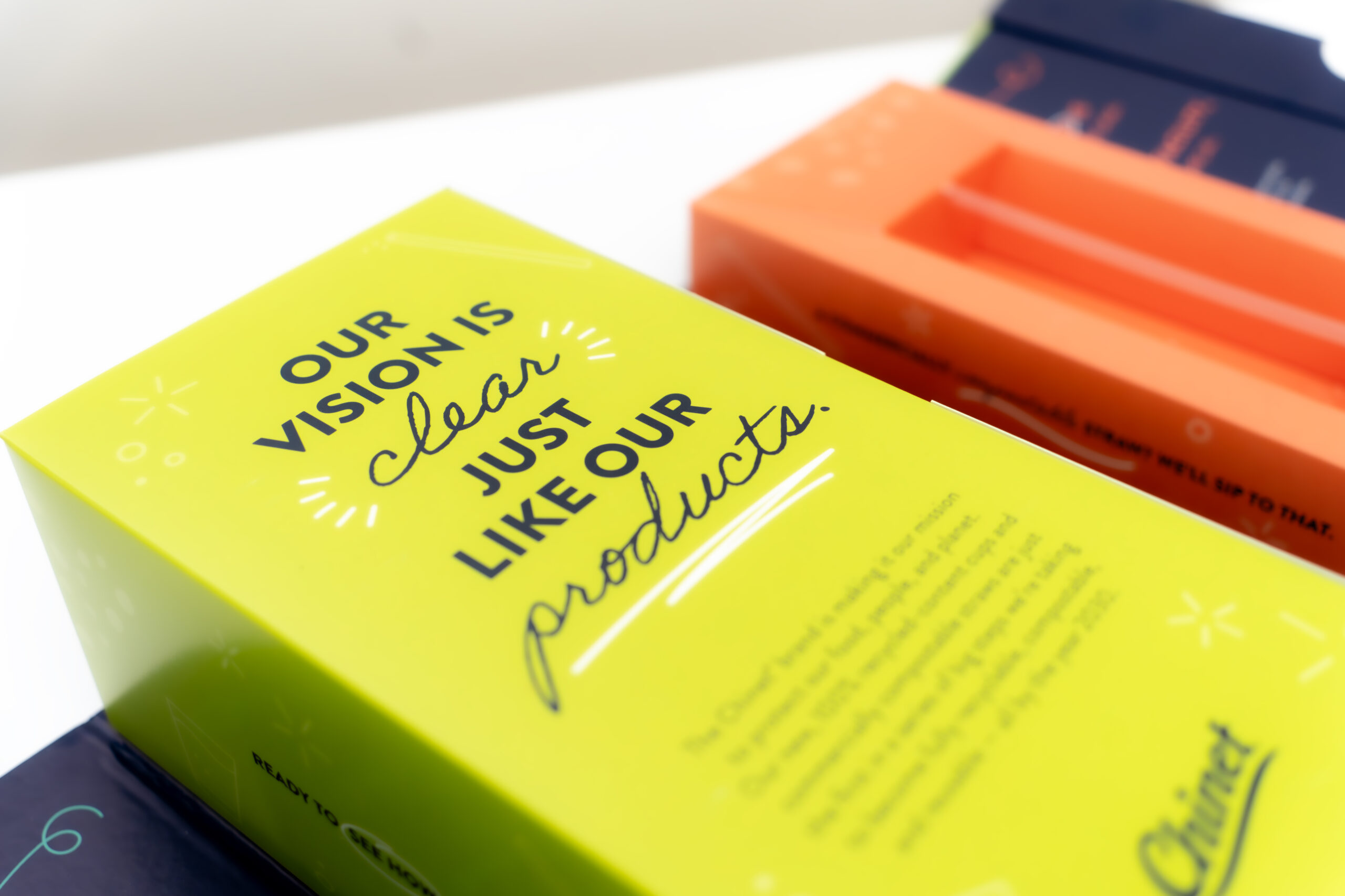
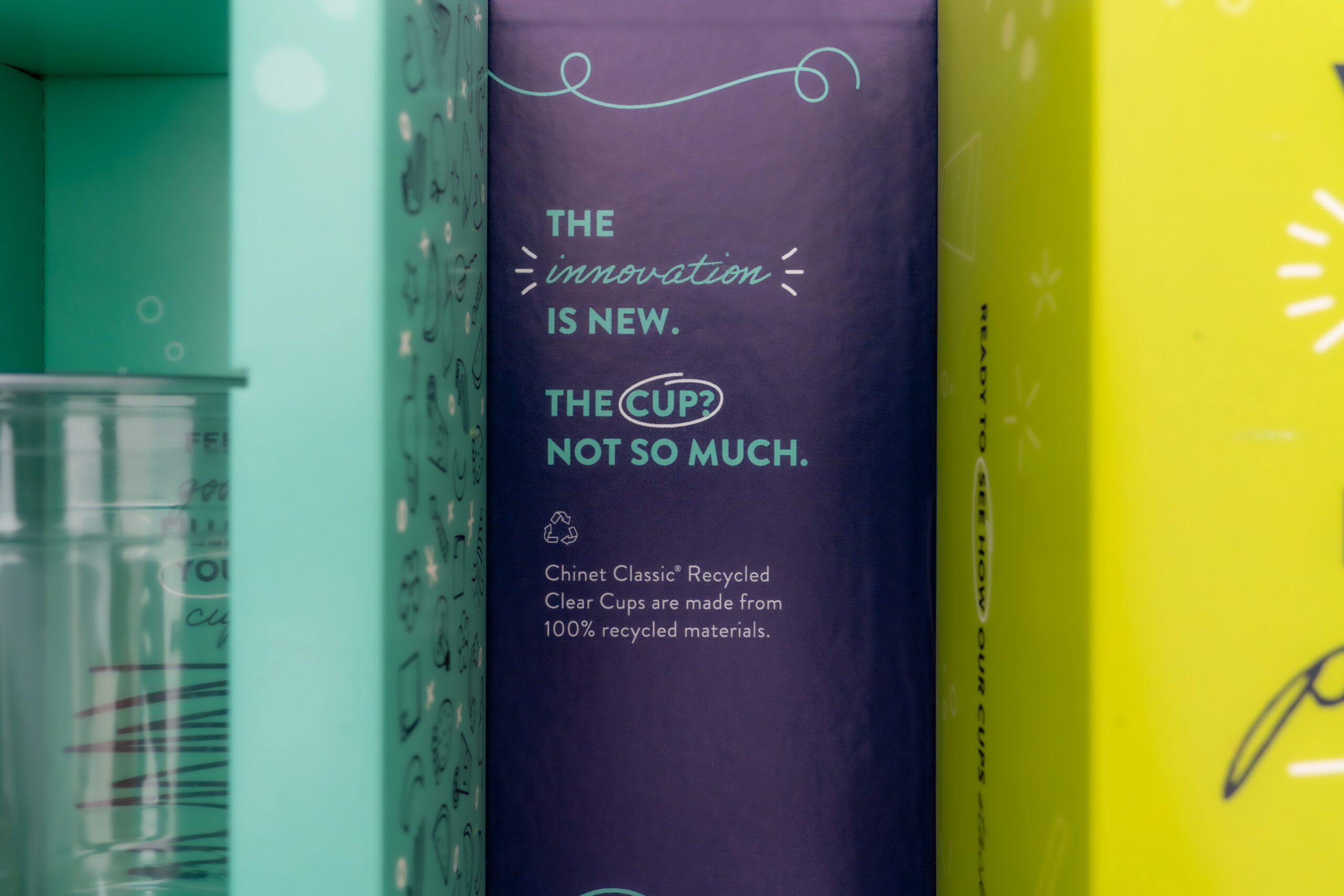
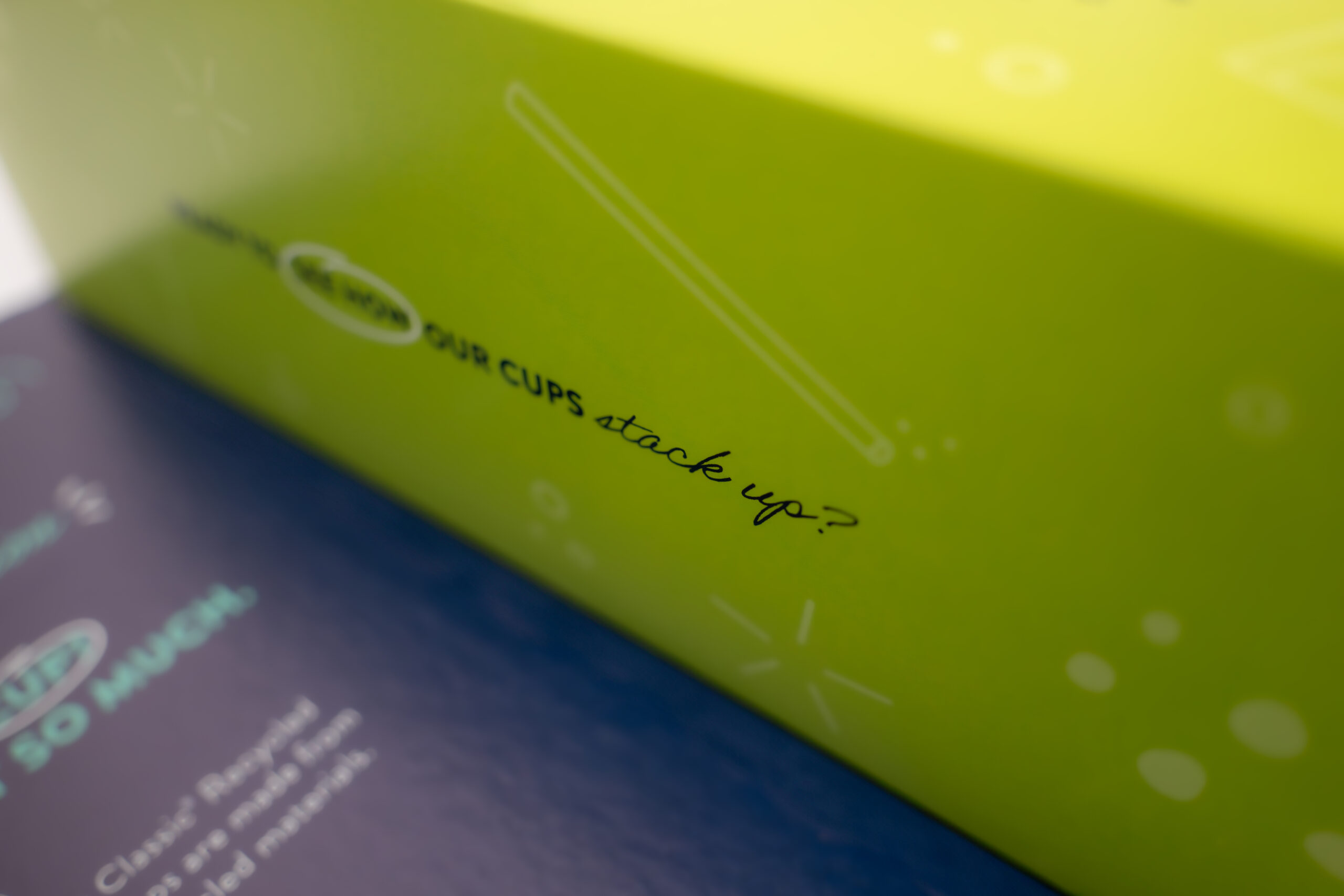
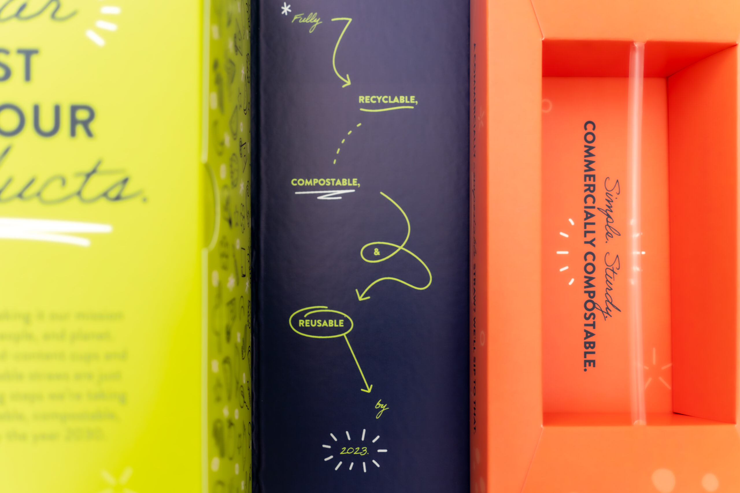
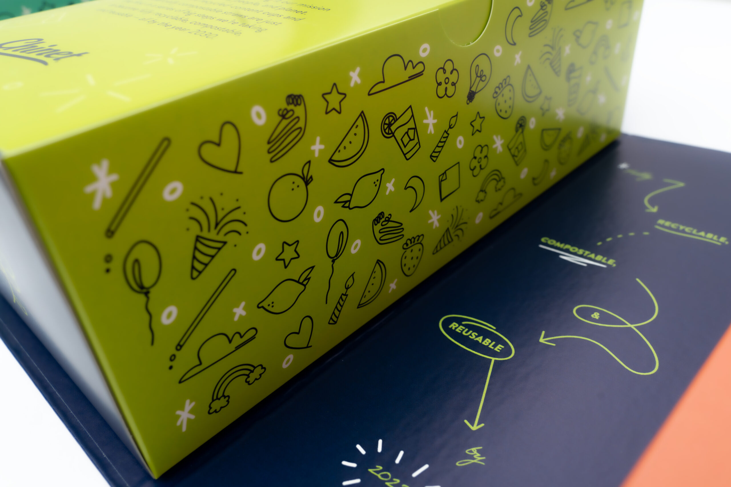
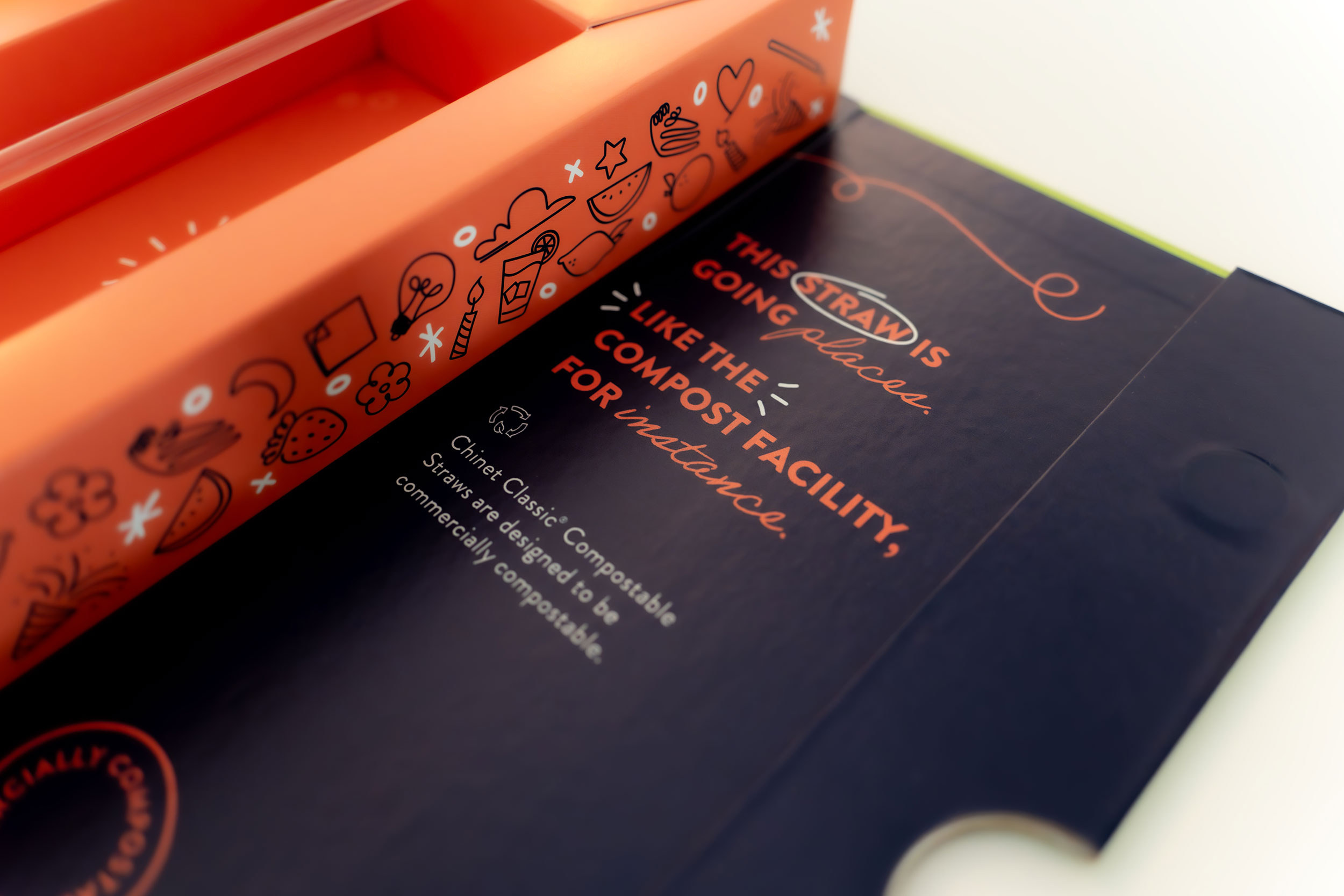
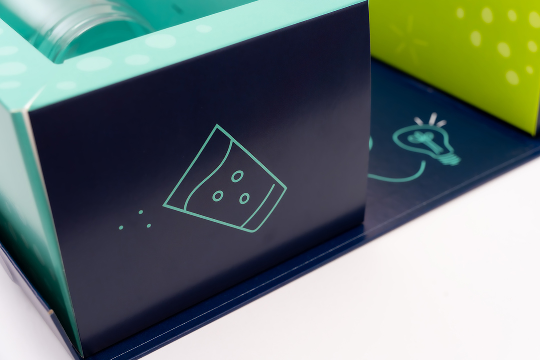
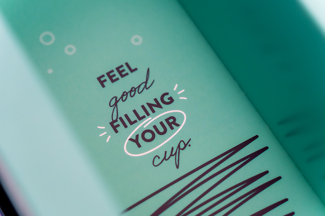
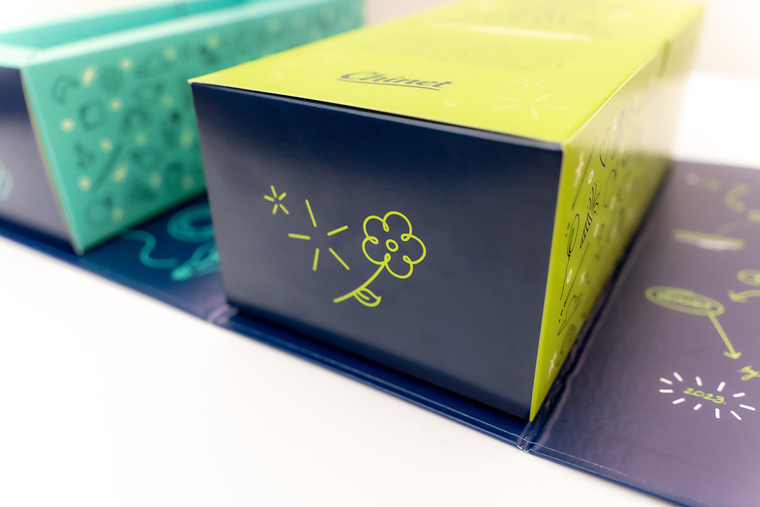
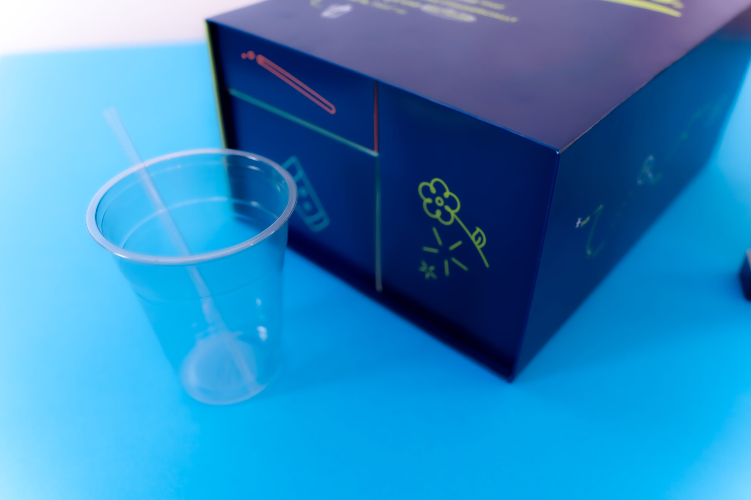
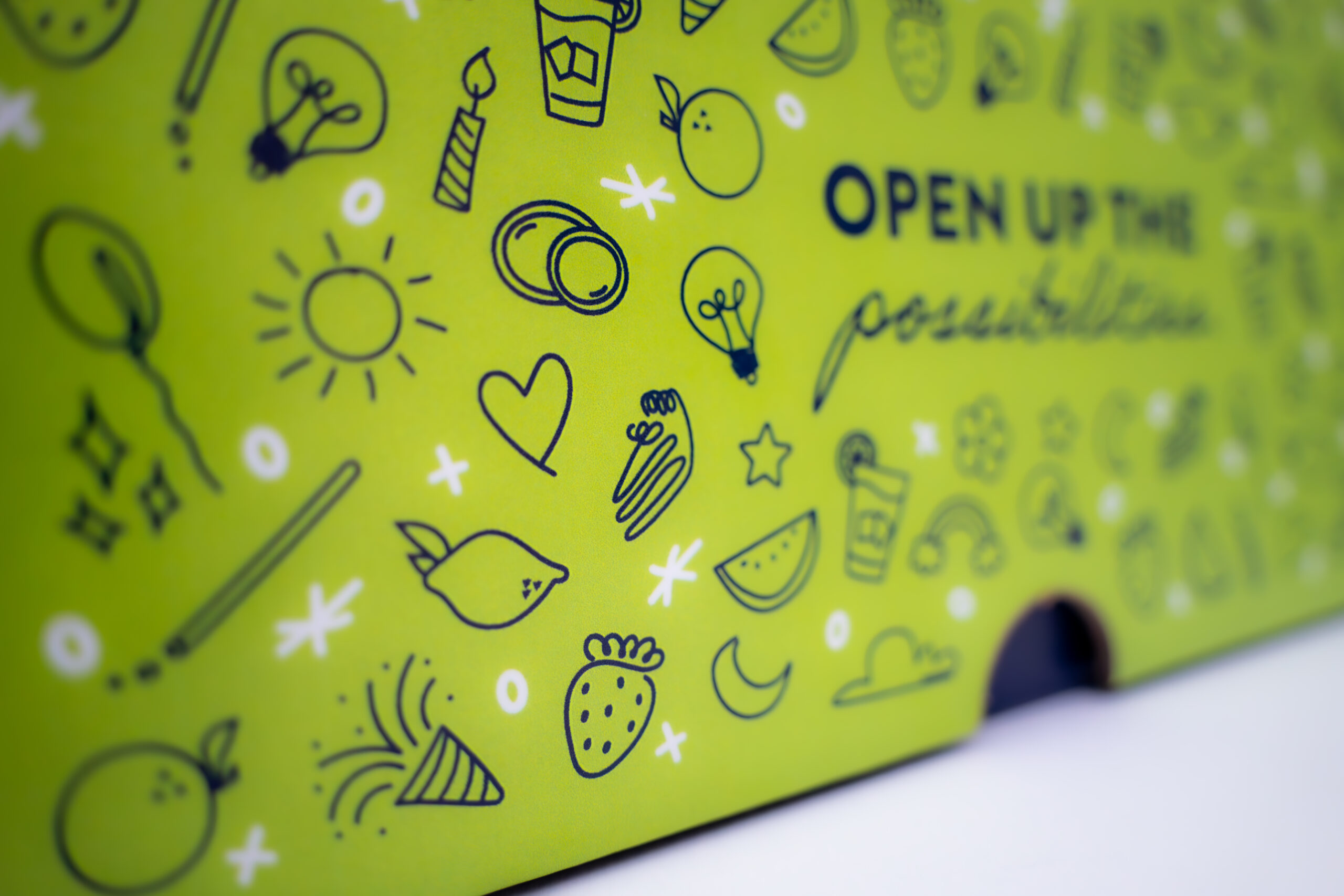
Simple yet impactful headlines were paired with bold product call outs. The bold brand colors helped capture unboxers attention while inviting copy begged for it to be explored. The flood of blue created a strong connection to the brand while the green door flap with patterning draws the eye as a place to start exploring the contents of the box. The box naturally unfolded to showcase the cup and straw suspended in air. Once open, there were vibrant brand color floods, playful type, and intriguing illustration that come together to tell story of this product introduction. Ultimately, it created an object that influencers and the media don’t want to get rid of and can’t help but share.

ICON®

Ice Cream Just Got Sweeter VIEW

Emprise Bank

A Website Built for Possibilities VIEW
MBB Flag Icon Click to return to home page Go to Homepage
MAKE IT MATTER
Instagram Facebook Linkedin