In its 38th year as a Kansas City-based advertising agency, MBB has undergone a complete rebrand, including new positioning and website. This is only the second rebrand in the company’s nearly four-decade history.
Two MBB partners, Jim Brown and Shan Neely, discuss how the new brand reflects the history of MBB while representing the future of the agency.
What was the reason for the rebrand?
Jim Brown, CEO: I think there are a number of reasons that spurred the decision. Some of them practical, some more philosophical. The practical element is that we are moving the agency to a new and more permanent home. So it just made sense to take another look at our brand and give it a refresh. Philosophically, the brand change represents an evolution of our work and the need for ideas that generate measurable impact.
Shan Neely, Partner: 2019 was a transformative year for us, as we challenged ourselves to continue staying nimble, efficient, and intentional in meeting changing client needs. We deepened our in-house ability to create video content with the acquisition of Burly Studios. We doubled downed in our commitment to offer focused expertise in CPG, Healthcare, and B2B. And we strengthened our digital build capabilities with the Blue Rivet acquisition.
As we look into 2020, there’s a lot happening there too, not only in terms of welcoming some new accounts, but in opening a new office in Old OP. So it seemed like a good time to self-evaluate what we stand for, what we want to accomplish and what really matters to our team and our clients. As client needs change, we have to be willing to change with them. The rebrand is one way of communicating that.
Why Make It Matter?
Shan: When John Muller opened the shop in 1982, he had a mantra: “Make It Cool.” And he did just that. But by 2005, you also had to make it smart. KPIs and ROIs mattered as much if not more than creative awards. With a creative heritage dedicated to making it cool and a strategic approach that puts consumer thinking at the forefront, today we operate at that intersection of cool and smart. That intersection is where we can really make our work matter. Matter to our clients and their customers. To their organization’s bottom line. And to ourselves in creating work we can be proud of.
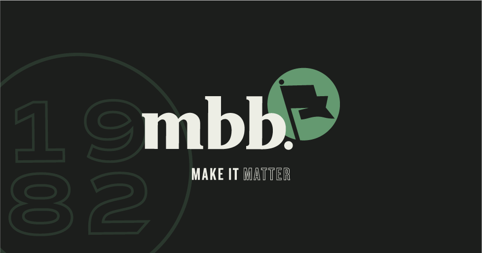
Tell us about the logo, colors, and overall look and feel of the new brand.
Shan: We were intentional in making this an evolution – to preserve a little of where we’ve been, but also speak to where we want to go. The new logo is certainly that – an evolution. But there’s a lot baked into it. We wanted to create a mark that had permanence – one the we could rally around long after we make the move to downtown Overland Park.
As for overall look and feel, the design team wanted to keep it simple, with a clean, efficient black-and-white approach. When you create work that really matters, you’re proud of it, and this approach lets the work stand on its own. An updated green accent color and a variety of brand marks, such as the scorpion, act as historic cues to our past. And because we feel like we’re planting a flag in standing for something, we designed a flag icon as a rallying symbol to remind us of our purpose – to create work that truly matters.
Did you consider a name change?
Jim: The Muller name and heritage is still relevant today, and it was my belief that the marketplace had made the connection of Muller to MBB. It just didn’t seem advantageous to make any type of switch. While the agency has evolved significantly in terms of capabilities, our core creative heritage remains, and we’re very proud of it.
What makes you most excited about the new branding and/or positioning?
Jim: I love the new look. It is clean, modern, and sophisticated. It is purposefully subtle to allow the work to be the hero. We wanted the look to be classic and allow our work to speak for itself.
Shan: For me personally, it’s something that a lot of people had a stake in. It was a team effort, and as a result, it reflects the entire agency. We all need and want a reason to get out of bed every morning, and making work that matters is a great reason. We each have a passion for it, and we each bring a unique skill set to every challenge. I think the rebrand communicates that.
What does the future look like for MBB?
Jim: There is so much to be excited about for the agency. We have a fantastic team in place across all of our disciplines. They all get along but challenge each other in a healthy way. The move to a new location always brings a certain amount of excitement. The area where we are going is really experiencing a renaissance, and it feels like that is where the firm is as well. We are better today. That is the question I always ask myself – are we improving incrementally all the time? I can give you an emphatic yes.
With a fresh brand and positioning, comes a new and exciting future for MBB. Check out some of the work we have done for current clients. Also, feel free to reach out. We’d love to hear from you.
Subscribe to our newsletter
Get our insights and perspectives delivered to your inbox.